
This week Kathy, Usman and I met to discuss how we would combine the projects we’ve been working on into a cohesive pathway and how we would analyze the output of CancerLinker as compared to PathLinker.
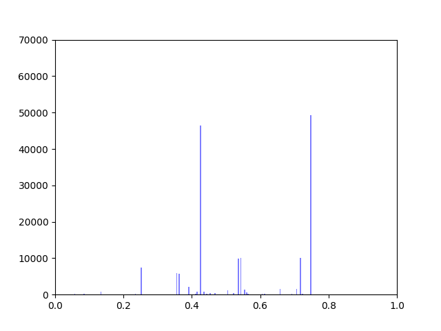
I have been working on ways to visualize the data. One thing I wanted to look at was how incorporating gene expression data would change the overall distribution of edge weights in the interactome.
The original interactome has a reasonable distribution with two values that seem to appear frequently around 0.4 and 0.8.
Gene expression data was incorporated into the original interactome with a beta value. The beta value determines the weight of the original edge weight when including the gene expression data. So the higher the beta score, the lower the importance of the gene expression data. I made three histograms one for a beta=0.25, one for beta = 0.5 (equal contribution between original edge weight and gene expression data) and one for 0.75
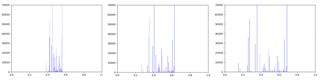
Left B=0.25, Middle B=0.5, Right B=0.75
As can be seen in the histograms above, when gene expression data is weighted more heavily, edges weights are more closely clustered. To investigate why this occurred I made two additional histograms: one of the gene expression data before it was transformed and one of the gene expression data after it was transformed.
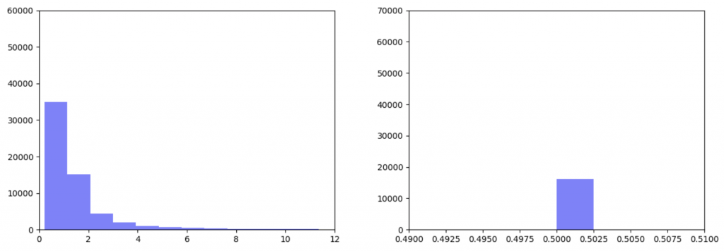
Right: Gene expression data after being transformed
After the gene expression data is transformed, there is extremely little variation. Additionally all the gene expression data is greater than or equal to 0.5 which should be the median. This would explain why weighting the gene expression data more heavily causes more closely-clustered edge weights. I’m not sure how to fix this. It seems like an error, but I’ve been over the code multiple times and the math seems right to me. So my next step is to figure out what’s going on there.
In the meantime I took the output from the pipeline that Kathy put together and put graphs for the top 1000 Wnt paths with β=0.25, 0.5 and 0.75 up on GraphSpace. If I figure out what’s wrong with the function that transforms the edgeweights, I will run it again and re-upload the updated graphs.