Implementing Bayesian Weighting – Part 3

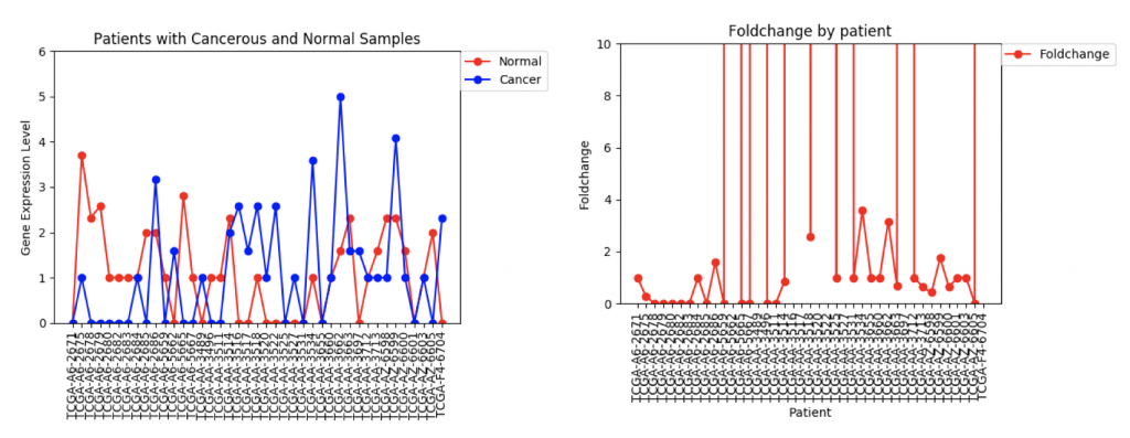
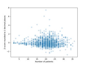
I finally managed to download all of the GO Terms and spent some time processing the data and editing previous code so that it all fit together. After having done so and obtained a working version of the code, an initial run revealed that the run time of weighting the entire HIPPIE Interactome would be approximately 101 days. This is outside the duration of the CREU so clearly something needed to be done. To fully explain the issues that lead to such a terrible run-time it is important to first have a rough understanding of the structure of the code.

This iteration of the code first produced a list of true positives and a list of true negatives on the criteria of GO Term co-annotation. This section of the code takes about 4 minutes (which can also be potentially sped up later on) but this negligibly contributes to the 3 month run time. The next portion implements functions that in conjunction calculate the cost of a given node. The necessary inputs are

  1.   A list of all the evidence types.
  2.   A dictionary where the keys are the evidence type labels and the values are lists (evidence lists) whose elements are the protein edges (represented as lists) which are confirmed to occur by that particular evidence type
  3.   A list of true positives and a list of true negatives.

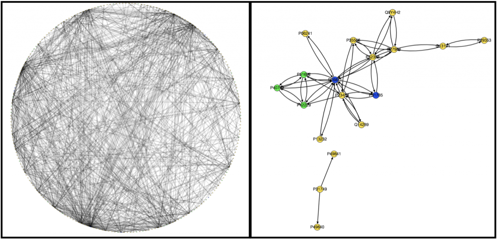
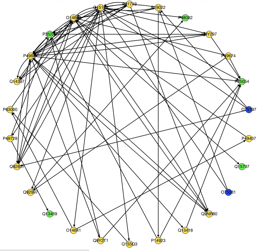
Finding the cost involves calculating the intersection and symmetric difference of the positives with the evidence lists and then the intersection and symmetric difference of the negatives with the  evidence lists. This was done each for each evidence list “every” time a new edge was weighted. This approach took roughly 2.5+ minutes per edge. With 93138 edges, this was the main contributor to the 3 month run time. Further inspection reveals that the time-complexity of performing these operations on a set is  O(min(len(s), len(t)) and O(max(len(s), len(t)) for a list. Performing this operation every single time was therefore very costly. Simply calculating these numbers for each edge at the outset and then appending them in a particular order to the end of each evidence list reduced the time needed to weight each edge down to approximately 0.45 seconds thus shaving down the total run-time to about 11 hours.

Another change that will significantly reduce the run time further is using sets instead of lists for the protein edges in the dictionary and representing the edges themselves as tuples. This will mean creating a different dictionary with identical keys but the values will the four calculated values mentioned above. This will supposedly shave off a large chunk of time because element look up in a set is significantly faster than the same operation in a list. Another idea is to change the order of calculations in a way that reduces the amount of time the exact same calculation is executed or to calculate the edges in a way that iterates over the approximately 230 evidence types rather than the 93138 edges.

Week 4: Cleaning up

With our big CNB-MAC paper deadline passed last Friday, my tasks this week have been relatively simple. My first goal this week was to take the bar chart figures in the paper and turn them into box and whisker plots.

For example, I took this figure:
figures/multi-layer-auc.png

and turned it into this:

figures/comparing_layers.png

The bar chart figure shows the mean AUC of each positive set with varying number of layers, while my figure is a little more descriptive. It shows the mean AUC as well as the interquartile range and outliers.

Next, we got some surprising news! We were notified that after a preliminary pass of the paper submissions, our paper was accepted to the CNB-MAC conference as either a talk or a poster (we’re still waiting to hear which one.) This gave us the opportunity to submit a two-page abstract by the end of next week, a more challenging task. I wrote up a quick rough draft that I will continue working on next week with Alex.

Finally, with our results generated and our paper submitted, it was time to clean up our github repo. This included deleting a lot of old code and useless output files as well as restructuring the code and writing README.md files. It’s looking a lot better now!

Week 5: Visualizing Data

This week I have continued trying to visualize and integrate gene expression data from GDC TCGA onto nodes in Graphspace. This is the graph I have so far:

Wnt Pathway with Gene Expression Data

The color of the nodes on the graph represent the mean foldchange of the gene. The foldchange is the ratio of gene expression of a cancerous tissue sample to a normal tissue sample from the same patient. There were 41 patients with colon adenocarcinoma who had gene expression data from both a tumor and a normal sample. The foldchange for each of these 41 patients was averaged to find the mean foldchange of each gene. Light blue indicates that the gene is slightly underexpressed in cancerous samples (less than 1 standard deviation), dark blue(not shown) indicates that the gene is underexpressed by 2 standard deviations, purple (not shown) indicates that the gene is underexpressed by greater than 2 standard deviations. Orange indicates that the gene is slightly overexpressed (within one standard deviation), dark orange indicates that the gene is overexpressed by 2 standard deviations, and red indicates that the gene is overexpressed by greater than 2 standard deviations.

One problem that came up was that some genes have a lot more variance in patient data than others. (Data on variance is available by clicking on the nodes in Graphspace). Additionally, patients that no gene expression or close to no gene expression in their normal samples had extremely high foldchanges that threw off the mean. It’s tempting to just throw away those samples as outliers, however several samples had multiple “outliers”. As an example I’ve included three sets of line graphs I made that show the gene expression data  and foldchange of each patient for three different genes:

CFTR Expression and Foldchange Line Graphs for 41 patients

In the first example, CFTR, one can see that cancerous samples tend to have lower gene regulation than healthy samples and most of the fold change values hover around 1.0, meaning that the change is fairly low.

FZD9 Gene expression and foldchange for 41 patients

The second example, FZD9, is slightly different. The FZD9 expression data is much less uniform. In some patients, FZD9 is largely overregulated in cancerous samples. In other, it’s largely under regulated. The foldchange data shows foldchanges that range from zero to extremely high values (greater than 30,0000). This occurs because those patients had normal sample values of 0.0. In this case, it looks like dismissing the two extremely high foldchanges as outliers would yield a more realistic data set.

ZSCAN4 Gene Expression and Foldchanges

However, in ZSCAN4, there are many patients with extremely high or low foldchanges. Instead of ignoring these patients, I think I need to find a way to normalize the data so that a few large foldchanges don’t completely throw off the data.

The next step in this project is to work with Usman and Kathy to integrate the gene expression data onto the edge weights so that PathLinker can calculate the most disregulated protein pathways. To begin this process, I’ve written a program that produces a text file that contains for each gene the ID, common name, mean foldchange, standard deviation, and either a +1, 0, or -1, which represents whether it’s under-regulated, unchanged, or over-regulated in cancerous samples. Right now the +1, 0, and -1 are really just placeholder values. I need to meet with Ibrahim and Anna to discuss how to better weight the nodes.

Implementing Bayesian Weighting Schemes – Part 2

I spent the majority of the week parsing through various databases and their associated tools to try to download GO Terms to form the set of positives and negatives required for the Bayesian Weighting Scheme. There appeared to be no easy way to download the GO annotations for specific proteins or to download specific GO Terms. Therefore, I simply downloaded a file containing all the GO annotations and stripped it of the unnecessary portions to form the positives and negatives. All that remains now is the integrate this with the remaining code for the weighting scheme. That will be the main objective of Week 5.

Week 4: Exploring Data

I spent this week developing an understanding of the command line and version control, as well as exploring the data gathered from the TCGA cancer genome data.

First, I discovered that an application I had downloaded to make my life easier (Anaconda) had deleted python 2.7 from my machine and wouldn’t allow me to run things appropriately. This was a huge problem because currently, I need to run programs using python 2.7 and networkx 1.9.1 for dependencies to work out. So, I deleted the installation files and made sure that all of the caches and file folders they resided in were deleted, and then used Homebrew to reinstall python 2 and python 3.  The moral of this story is to always understand what you’re installing.

Secondly, I developed the framework for the bar graph that we will eventually use to analyze which genes are present in each of the datasets we are looking at. We are measuring the number of genes with different levels of gene expression(high, low, or none) in each of the datasets that we have. Each dataset will then have 3 different bars expressing this data.

We’ll be using  the TCGA Genes database,  the number of genes from the PathLinker-2015 interactome, PathLinker-2018 interactome, the Wnt Pathway from NetPath, the PathLinker-2015 interactome’s top 1000 paths, the PathLinker-2018 interactome’s top 1000 paths, and finally the Localized PathLinker-2015 interactome’s top 1000 paths, as well as the Loc_PL 2018 interactome’s top 1000 paths.

Week 4: Obtaining and Processing Data

This week our main goal has been to find a pipeline to obtain TCGA data in a neat form. We discovered UCSC’s Xena Browser, which has files from the TCGA and a number of other databases.

Last week, we used the data from FireBrowse to make a graph of the genes that have patients with abnormally high or low levels of expression.

Number of patients that have abnormally high or low levels of expression

This week we changed that graph slightly by showing the difference between the number of patients with high expression and the number of patients with low expression by gene.

Number of patients by gene that have abnormally high or abnormally low levels of gene expression.

It is interesting to me that there are generally more patients with severe under-expression rather than severe-overexpression. I wonder if this is because these genes play a role in suppressing tumors, and that therefore maybe under-expression is more likely to cause cancer than overexpression?

I also worked on integrating gene expression data from Xena into our graph of the Wnt pathway.

Wnt Pathway from PathLinker with Gene Expression Data. Red = high, orange = medium-high, yellow= medium, green = low, blue(not shown) = very low, white(not shown) = no expression. Triangles are transcription factors, squares are receptors, circles are intermediate proteins.

Kathy figured out what was wrong with PathLinker the first time we ran it and re-ran it. I am working on turning it into a graph, but the input data is very different because it’s coming from a different version of NetPath so I need to change the program to be able to process the new data.

I also noticed while I was processing the expression data from Xena that there was a large amount of variability in gene expression between patients. I’m currently working on several things. Instead of just averaging gene expression for genes I’m comparing gene expression patient-by-patient so I’m comparing a tumor sample to a normal tissue sample for every patient. I also want to come up with a way to visualize the variance of expression among patients, because the more variance there is the less significant differences in expression between cancerous and normal tissue are. Anna suggested I do this by making the borders on nodes with high variance thicker. I am also going back and checking my math on gene expression to make sure that it is actually statistically significant and is conducted in a way that is similar to how other researchers have done similar research in the past.

Week 3 – Implementing Bayesian Weighting Schemes

The achievements from last week as well as the goals were laid out in this progress report. Accordingly, I spent the majority of this week working on an implementation of the Bayesian Weighting Scheme I discussed last week. This involved carefully fleshing out all the minutiae of the relevant paper (which I laid out and explained in this document from last week). I then applied the code onto a small toy-network that I made myself and then hand-calculated a few edges to verify my implementation.

Toy Network from Bayesian Weighting Scheme Implementation

I am currently working to implement the weighting scheme onto the HIPPIE Interactome. Thus far this has meant simply writing code to read the relevant text files and format the data efficiently in a way that meshes well with code I wrote for the toy example. Eventually, I will compare the scores of edges from this weighting scheme to the ones on the actual HIPPIE Interactome and further analysis on the differences between the two weighting schemes will probably be among the next steps. Besides implementing the Bayesian Weighting Scheme I have also been working to understand the underlying statistics behind the methods used to weight the HIPPIE Interactome. I will try to have a document that explains the mathematics for this in similar fashion to the one for the Bayesian Weighting Scheme.

Week 2: Sinksource+ and AUCs

We found an algorithm that solves the edge case problem. Sinksource+ removes the negatives and adds one negative to every single node. The weight of the edge is also a constant, which means that it’s the same for a node of any degree. This significantly devalues nodes that aren’t very well connected and would not be suitable for polygenic analysis.

However, it works horrendously in a single layer method with no prime nodes. The AUC sticks at around 0.5, which is the worst possible AUC you can have. However, it works great in a two layer network, giving our SZ network a score of 0.65. If you add negatives back in with the addition of sinksource+ and reduce the sinksource+ constant, we get an SZ AUC of 0.675 and a cell motility AUC of 0.801, which is the best AUC we have seen for an SZ gene identifier. I’m also running the program on the autism positives right now, and it appears that the AUC is running at about similar levels to where they were with E1 and E2.

Figure 2

Krishnan, A. et al.Genome-wide prediction and functional characterization of the genetic basis of autism spectrum disorder. Nature Neuroscience19,1454 (2016).
I think we are at the point where we will begin writing the paper. These results are a satisfying in that it’s probably just the nature of SZ that genes implicated are going to be difficult and somewhat disparately related. That’s not necessarily a bad thing. Polygenic positives are by definition only contributing slightly towards a disease. The strongest p-value for a SNP in an SZ GWAS has a frequency of 0.765 in SZ participants and a frequency of 0.75 in control participants. A low AUC in an SZ gene labeler is almost expected.
Goals for next week: Write the paper

Week 3: Processing Data from FireBrowse and PathLinker

On Monday we all met with Anna to agree on some goals for the week. Kathy and I set out to acheive several things: A. to figure out how to download data from FireBrowse on colon adenocarcinomas, to perform several statistical analyses on that data and to visualize it in some form using pylab, B. to write a code that produced informative graphs of the different signaling pathways from text files containing information about the edges and nodes and C. to implement PathLinker and LocPL and to create graphs of the top k paths on GraphSpace.

Originally to acheive our first goal, we tried to use Nicholas Egan’s pepper pathway code to download and format the data. However, while we were able to decipher how it worked, it ended up not being all that useful to us, so Kathy downloaded all the gene files related to colon adenocarcinoma onto her computer . Unfortunately, we’re still not really sure how to use them. We wrote a code that took text files containing information on edges and nodes and spit out a graph with color-coded nodes that were labeled with the node name and type and edges that were labeled with the type of interaction that was occuring between the two nodes for example “physical” or “phosphorylation”. I have attached to examples of the graphs we produced below, one very complex and the other very simple.

Left: Alpha-6-Beta-4 Integrin Graph. Right: Interleukin-7 Graph

We also ran PathLinker on the Wnt pathway and made a graph of the top 200 best paths produced.

Top 200 Wnt Signaling Pathways

Moving forward we have several goals. Kathy is trying to figure out how to implement LocPL. I am still trying to figure out how to process and use the FireBrowse data. Because I will need to integrate methylation data from FireBrowse in my project, it is essential I figure out how to use it.

Overall, this week I have learned a lot about data processing, writing code to read text files, and using NetPath, PathLinker, FireBrowse, and GraphSpace. These skills should come in handy as I move forward in my project.