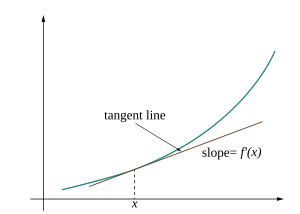
In a first course in calculus, many students encounter an image similar to the following:

Such an illustration highlights a key property of the single variable derivative: it’s the best linear approximation of a function at a point. For functions of more than one variable, the derivative exhibits this same characteristic, yet there is no obvious corresponding picture. What would an analogous visualization look like for a multivariable function?
For the past few weeks, I’ve been working towards a visualization of multivariable functions and their derivatives. Check out the end result here, or read on to hear about my process. I assume some knowledge of calculus and mathematical notation.
Visualizing vector fields in the plane
To make matters simple, I narrowed my focus to functions [latex]f : \mathbf{R}^2 \to \mathbf{R}^2[/latex]. The derivative of such a function is also a transform [latex]\mathbf{R}^2 \to \mathbf{R}^2[/latex]. Thus to build a visual representation of the derivative, I first needed a general purpose visualization of vector fields in the plane.
Consider a particular function [latex]f : \mathbf{R}^2 \to \mathbf{R^2}[/latex] given by
$$
f(x,\ y) = \left( \frac{x^3 + y^3}{3}, \frac{x^3}{3} – y \right)
$$
What does [latex]f[/latex] look like? A common representation of such functions selects a uniformly-spaced set of points in [latex]\mathbf{R}^2[/latex], and draws an arrow at each point representing the magnitude and direction of the vector field:

This is sometimes called a vector plot. For static mediums like a textbook or chalk board, this is an intuitive visualization of [latex]f[/latex]. However, I wanted to make use of additional visual techniques made possible with computer graphics. I came up with the following:
- Draw a line in [latex]\mathbf{R}^2[/latex].
- Consider the line as a discrete collection of points (a polyline).
- Apply a function [latex]\mathbf{R}^2 \to \mathbf{R}^2[/latex] to those points.
- Draw a new line through the transformed points.

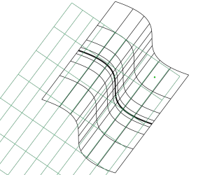
Performing those steps on a grid of lines in [latex][-2,2] \times [-2,2][/latex] with the function [latex]f[/latex] from above produces the following visual:

Neat-o! The transformed grid gives some sense of how [latex]f[/latex] deforms and stretches the Euclidean plane. As another example, the linear map given by
$$
A = \begin{pmatrix}
2 & 1 \\
0 & 2
\end{pmatrix} \in \textrm{Mat}_{2 \times 2}(\mathbf{R})
$$
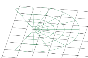
yields the following picture when applied to a grid around the origin:

As one might expect, the linear map sends linear subspaces to linear subspaces (straight lines to straight lines). The visualization has a rather vivid aesthetic—there is no curvature in the transformed result. This will be helpful for understanding the multivariable derivative, which is always a linear map.
To give the visualization more object constancy, I animate between the starting and ending states of each line as well. As a fun aside, the data of such an animation are computed by what mathematicians call a straight line homotopy; as a coder, this is a tween function of SVG path elements. If you would like to peek under the hood of the visualization, be sure to check out the main d3-based drawing method here.
The multivariable derivative
Inspired by the common single variable visualization of the derivative, I wanted to plot functions [latex]f : \mathbf{R}^2 \to \mathbf{R}^2[/latex] alongside a derivative-based approximation function. What does this approximation look like in the multivariable case?
If it exists, the derivative of a multivariable function [latex]f : \mathbf{R}^n \to \mathbf{R}^m[/latex] at a point [latex]\mathbf{a}[/latex] is a linear function [latex]T[/latex] such that [latex]h : \mathbf{R}^n \to \mathbf{R}^m[/latex] given by
$$
h(\mathbf{x}) = f(\mathbf{a}) + T(\mathbf{x – a})
$$
approximates [latex]f[/latex] well near [latex]\mathbf{a}[/latex]. More precisely, we require that
$$
\lim_{\mathbf{x} \to \mathbf{a}} \frac{| f(\mathbf{x}) – h(\mathbf{x}) |}{| \mathbf{x – a} |} = 0
$$
If such a linear transform [latex]T[/latex] exists, it is unique and is given by the Jacobian matrix of partial derivatives
$$
Df(x_1,\ x_2,\ \ldots,\ x_n) := \begin{pmatrix}
\frac{\partial f_1}{\partial x_1} & \frac{\partial f_1}{\partial x_2 } & \ldots & \frac{\partial f_1}{\partial x_n} \\[1.1em]
\frac{\partial f_2}{\partial x_1} & \frac{\partial f_2}{\partial x_2 } & \ldots & \frac{\partial f_2}{\partial x_n} \\[1.1em]
\vdots & \vdots & \ddots & \vdots \\[0.4em]
\frac{\partial f_m}{\partial x_1} & \frac{\partial f_m}{\partial x_2} & \ldots & \frac{\partial f_m}{\partial x_n}
\end{pmatrix}
$$
Suppose we choose [latex]\mathbf{a} = (1.8,\ 1.4)[/latex] and compute [latex]h[/latex] for the particular [latex]f[/latex] given before. Plotting both [latex]h[/latex] and [latex]f[/latex] together (with [latex]h[/latex] in green) yields the following visual:

Immediately we can see the essential properties of the derivative: near the chosen point [latex]\mathbf{a}[/latex], the function [latex]h[/latex] closely approximates [latex]f[/latex]. Moreover, this approximation is linear; the grid transformed by [latex]h[/latex] consists only of straight lines, indicating that it is a linear function. Be sure to check out the full animated version of this visualization to see different functions at work!
Extending the visualization to complex functions
Conveniently, this visualization can also be adapted to visualizing functions [latex]\mathbf{C} \to \mathbf{C}[/latex]. Just like functions of real numbers, complex functions can be differentiated and have an approximation function
$$
h(z) = f(a) + f'(a)(z – a)
$$
where [latex]a,\ z \in \mathbf{C}[/latex] and [latex]f'[/latex] is the derivative of [latex]f[/latex].
Typically a point in the complex plane is written as [latex]a + bi[/latex] for some [latex]a,\ b \in \mathbf{R}[/latex]. We could alternatively notate this point as [latex](a, b)[/latex], which looks just like a point in [latex]\mathbf{R}^2[/latex]! These points operate under a different arithmetic, but can be fed to the same visualization algorithm. In this case, we get a depiction of the points on the real-imaginary plane. Here, for example, is a visualization of the complex exponential function [latex]f(z) = e^z[/latex] and its derivative:

Closing thoughts
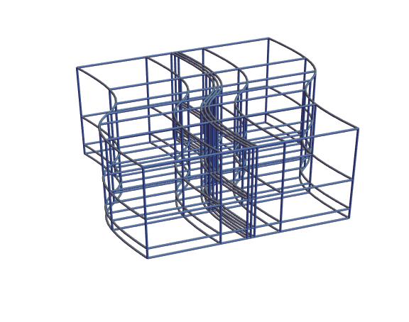
Next up I’m planning a 3D-printable version of this same visualization. The idea is to perform similar deformation of a lattice in [latex]\mathbf{R}^3[/latex].

More on this soon!
For the curious or computer-minded, the code for this visualization is on GitHub. Highlights include a totally bonkers JavaScript implementation of complex arithmetic or the main plot component. I would also love to hear any further ideas for visualization in this area.