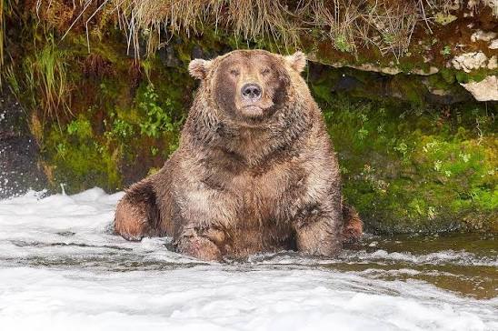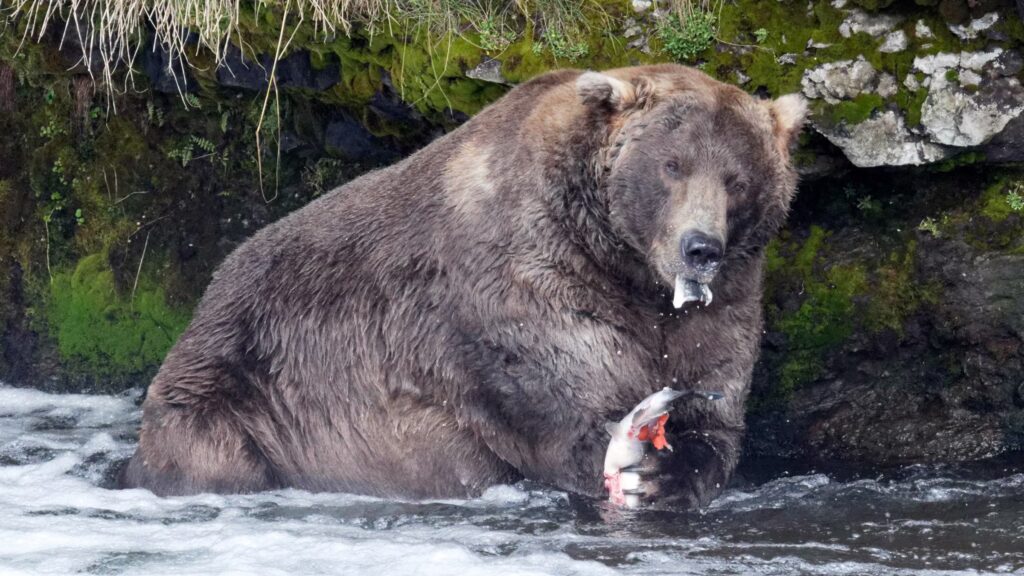
Two fat bears: 435 Holly (left) and 747 (right)
If you haven’t heard, Fat Bear Week is an annual online contest run by Katmai National Park and Preserve in Alaska. The public votes on which brown bear has done the best job of fattening up for winter. The site Explore.org runs live webcams at along the Brooks River where the bears hunt salmon, so people all over the world can watch the bears fish throughout the season.
The contest of bear fatness started in 2014 as a day of single voting, but has expanded into a bracket style tournament that lasts a week. The contest continues until September 29th, so go vote for the fattest bear!
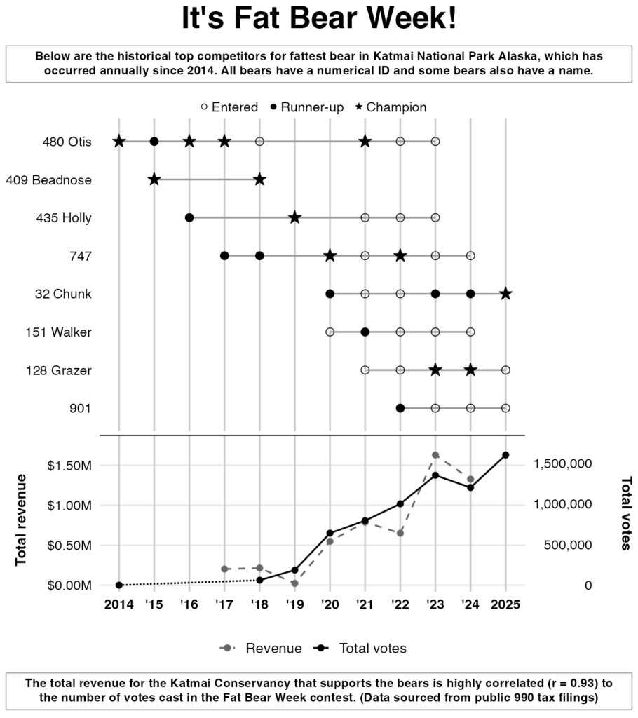
Our graphic this week shows the history of past champions and the correlation between votes in the contest and money raised for the nature preserve.
Where did we find the data?
There’s no official Fat Bear Week repository, so honestly getting the data was kind of a pain. Vote totals and winners were compiled by hand from the National Park Service, Explore.org (which hosts the bear cams and the voting), and news coverage of each year’s contest. The revenue of the Katmai Conservancy was much easier to find and comes from their IRS Form 990 filings. All nonprofits (including schools like Reed) have to file these publicly, which makes them a good source for data. You can find them on ProPublica’s website.
Some information was not possible to find. I couldn’t find the full list of bears entered in the competition for years before 2020, only the champion and runner up were available. The vote counts are also rough estimates that were reported from news sites, not hard numbers from Explore.org. I also couldn’t find any estimates for 2015-2017, but 1700 votes were cast in the first year of the contest.
If you’re interested in looking at the raw data, you can find csv files with data for each year on the Quest repository of the Data@Reed Github page. The ‘summary.csv’ file contains the information used to make the graph, and the other files contain information about individual bears, their relation to one another, and the sources I used to find this data.
Making the Graphic
The code to the graphic is in ‘scripts/analysis.R’ on the Github page, but I will copy the relevant portions of it below. There’s an additional script that pulls together data for the summary file and another that compiles the sources, but these aren’t really material to the analysis.
The final figure is two charts stacked on top of each other and sharing one year axis. I used four packages besides the tidyverse: {ggstar} for star-shaped markers, {patchwork} for stacking plots, {ggtext} for the boxed subtitle and caption, and {scales} for axis labels.
The first bit of the script just to see which bears had the most appearances in the contest so that we could only graph those. When I did this, bear 409 was not included because the data about entries wasn’t great for the first few years. So I forced the appearances to include Beadnose because she was a two-time champion. Then I added some labeling columns so that things would appear nicely on the graph and set how the years would be displayed on the x-axis in order to save room.
Click to see the wrangling R script
library(tidyverse)
library(ggstar)
library(patchwork)
library(ggtext)

# --- Update summary.csv with labeled entries/champion/runner_up ---------
appearances <- read_csv("data/appearances.csv", show_col_types = FALSE)
summary_df <- read_csv("data/summary.csv", show_col_types = FALSE)
bears <- read_csv("data/bears.csv", show_col_types = FALSE)

bear_names
  mutate(bear_id = as.character(bear_id)) |>
  select(bear_id, name)

# " " labels, falling back to just the bear_id
label_bears
    left_join(bear_names, by = "bear_id") |>
    mutate(label = if_else(is.na(name), bear_id, str_c(bear_id, name, sep = " "))) |>
    pull(label)
}

# Per-year entry list (2014-2020 = finalists only)
entries_per_year
  mutate(bear_label = label_bears(bear_id)) |>
  arrange(bear_label) |>
  summarize(entries = str_flatten(bear_label, collapse = ", "), .by = year)

summary_out
  select(-any_of("entries")) |>
  left_join(entries_per_year, by = "year") |>
  relocate(entries, .after = year) |>
  mutate(
    year = as.integer(year),
    champion = label_bears(champion),
    runner_up = label_bears(runner_up)
  )

write_csv(summary_out, "data/summary.csv")

# --- Per-bear contest chart ---------------------------------------------
# TODO: bump a bear now that 409 is force-included (8 shown)
min_appearances <- 4
force_include <- c("409")

completed_appearances
  filter(year != 2026)

qualifying
  count(bear_id, name = "n_appearances") |>
  filter(n_appearances >= min_appearances | bear_id %in% force_include)

contest_data
  inner_join(qualifying, by = "bear_id") |>
  mutate(
    label = label_bears(bear_id),
    status = case_when(
      result == "champion" ~ "Champion",
      result == "runner_up" ~ "Runner-up",
      TRUE ~ "Entered"
    ) |> factor(levels = c("Entered", "Runner-up", "Champion"))
  ) |>
  mutate(first_year = min(year), .by = bear_id) |>
  mutate(label = fct_reorder(label, -first_year, .fun = min))

contest_span
  summarize(min_year = min(year), max_year = max(year), .by = c(bear_id, label))

contest_years <- min(contest_data$year):max(contest_data$year)

</details>
Next I started arranging the plot. I created each component of the chart separately and then used the package {patchwork} to arrange them into one figure. I first started with just the title and the boxed text that I wanted to appear at the top and bottom.
Show the graph headings code
title_text <- "It's Fat Bear Week!"
subtitle_text <- "Below are the historical top competitors for fattest bear in Katmai National Park Alaska, which has occurred annually since 2014. All bears have a numerical ID and some bears also have a name."
title_style <- element_text(face = "bold", size = 28, hjust = 0.5)

# Shared boxed-text style for subtitle/caption
boxed_text <- function(outer_margin) {
  element_textbox_simple(
    size = 11, face = "bold", color = "black", hjust = 0.5, halign = 0.5,
    margin = outer_margin, padding = margin(5, 8, 5, 8),
    linetype = 1, box.color = "grey60", linewidth = 0.4, fill = NA
  )
}
</details>
Then I made the top chart by using the geom_segment() command. A start shape isn’t an option within basic ggplot, so that’s where the {ggstar} package came in. Then I just did a lot of adjusting the theme to get things to look exactly how I wanted them. That’s one of the greatest things about R is you can really customize things down to a very fine level.
Show code to make the contest chart
title_text <- "It's Fat Bear Week!"
subtitle_text <- "Below are the historical top competitors for fattest bear in Katmai National Park Alaska, which has occurred annually since 2014. All bears have a numerical ID and some bears also have a name."
title_style <- element_text(face = "bold", size = 28, hjust = 0.5)

# Shared boxed-text style for subtitle/caption
boxed_text <- function(outer_margin) {
  element_textbox_simple(
    size = 11, face = "bold", color = "black", hjust = 0.5, halign = 0.5,
    margin = outer_margin, padding = margin(5, 8, 5, 8),
    linetype = 1, box.color = "grey60", linewidth = 0.4, fill = NA
  )
}
</details>
Next I made the revenue plot with the votes displayed on the same figure as an overlay. To do this, the y-axis on the left was set to show revenue and the y-axis on the right shows total vote. I got lucky here because these numbers scale almost identically. That often doesn’t happen, so then you’d need to use transformations to make your it work on the same figure, or just separate the two data sources to their own figures.
Show code to make the revenue and votes graph
title_text <- "It's Fat Bear Week!"
subtitle_text <- "Below are the historical top competitors for fattest bear in Katmai National Park Alaska, which has occurred annually since 2014. All bears have a numerical ID and some bears also have a name."
title_style <- element_text(face = "bold", size = 28, hjust = 0.5)

# Shared boxed-text style for subtitle/caption
boxed_text <- function(outer_margin) {
  element_textbox_simple(
    size = 11, face = "bold", color = "black", hjust = 0.5, halign = 0.5,
    margin = outer_margin, padding = margin(5, 8, 5, 8),
    linetype = 1, box.color = "grey60", linewidth = 0.4, fill = NA
  )
}
</details>
There’s a little bit of code in there that also runs cor() which calculates the Pearson’s correlation coefficient to test the linear correlation between the two datasets. Note that this isn’t saying anything about the cause of the trends, just that they do go up at a very similar rate, 0.93, where 1 is a perfect relationship.
Then I added code to stack the figures and display only one x-axis at the bottom of the graph.
Show code to make the contest chart
# --- Combined stacked figure -----------------------------------------
# Drop top chart's x-axis (shown below instead)
contest_chart_top <- contest_chart +
  theme(
    axis.text.x = element_blank(),
    axis.ticks.x = element_blank(),
    plot.margin = margin(b = 2)
  )

# Shared year axis between the two panels
overlay_chart_bottom <- overlay_chart +
  scale_x_continuous(
    breaks = contest_years, labels = abbreviate_years, limits = range(contest_years),
    position = "top"
  ) +
  theme(
    axis.text.x.top = element_text(color = "black", size = 12, face = "bold"),
    axis.ticks.x.top = element_blank(),
    plot.margin = margin(t = 2)
  )

contest_and_overlay <- contest_chart_top / overlay_chart_bottom +
  plot_layout(heights = c(3, 1.5), axis_titles = "collect") +
  plot_annotation(
    title = title_text,
    subtitle = subtitle_text,
    caption = caption_text,
    theme = theme(
      plot.title = title_style,
      plot.subtitle = boxed_text(margin(t = 4, b = 6)),
      plot.caption = boxed_text(margin(t = 6, b = 2))
    )
  )
contest_and_overlay
</details>
Adding the text boxes was the fiddliest bit. Honestly, that’s something that probably could have been done easier in an imaging program like PowerPoint or Adobe, but I get stubborn when I know something can be done in R, so I pushed until everything was tweaked just how I wanted it.
Things you could do with this data
Inside the spreadsheets, there’s more data about each bear. There’s information on their family members, their sex, and the year they were born. A more thorough internet search could probably reveal even more than is already in there. Here are a few ideas of other things you could do with this data:
- Who’s fatter: mama bears or papa bears?
- Does a bear do a better job of fattening up over time or are they the fattest when they’re young and able to exert more energy hunting?
- You could trace the lineage of many of the bears to see if champions beget champions or if fatness is maybe more environmental.
- You could look up data about salmon numbers in Alaska for the same years as the bear data. Then you could see if there was any correlation between the winners and the salmon abundance. For that, you’d probably need to have a fat score for each bear, which you could subjectively do based off of pictures.
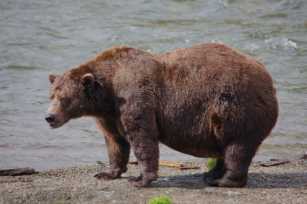
I’ll leave you with a couple pictures of Otis, the four-time champion. RIP, you fat bear!