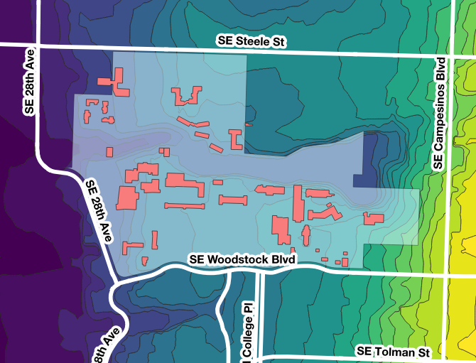
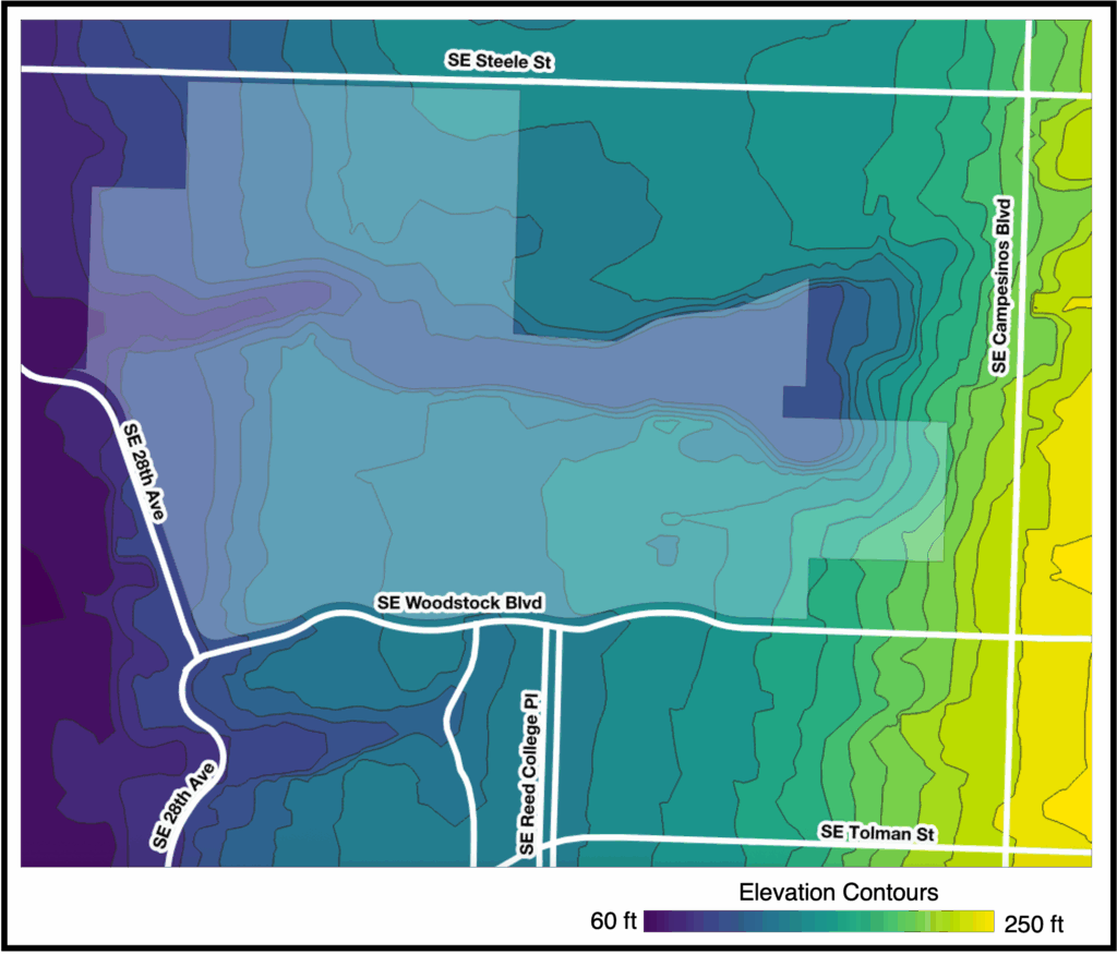
Looks better in color, huh?
It’s actually surprisingly difficult to convey all the information you’d like to in just black and white and in a small format. I tried grayscale on the map but it didn’t read well, so I just left contour lines, but the colored image shows what’s going on much better.
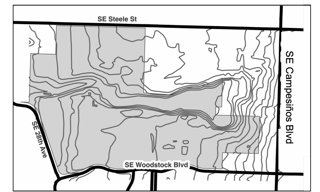
Chavez Campesinos Blvd
The biggest surprise in making this map was that Chavez has been officially renamed in Oregon’s databases as Campesinos Blvd. They are going to begin changing signs soon. The decision was made official on September 9th by a unanimous city council vote.
How this map was made
To create the contours on this map, I used a file from Oregon Metro’s Regional Land Information System (RLIS). They host hundreds of publicly available datasets that cover a wide range of topics including geographical maps, but files about Oregon demographics, climate and environmental data, civil buildings, transportation, and more. It’s a great resource for many projects.
I used the contour map with five feet intervals to get elevations for the Portland area. This came in the form of shape files (.shp), which initially just looks like a series of lines, not shaded areas between lines.
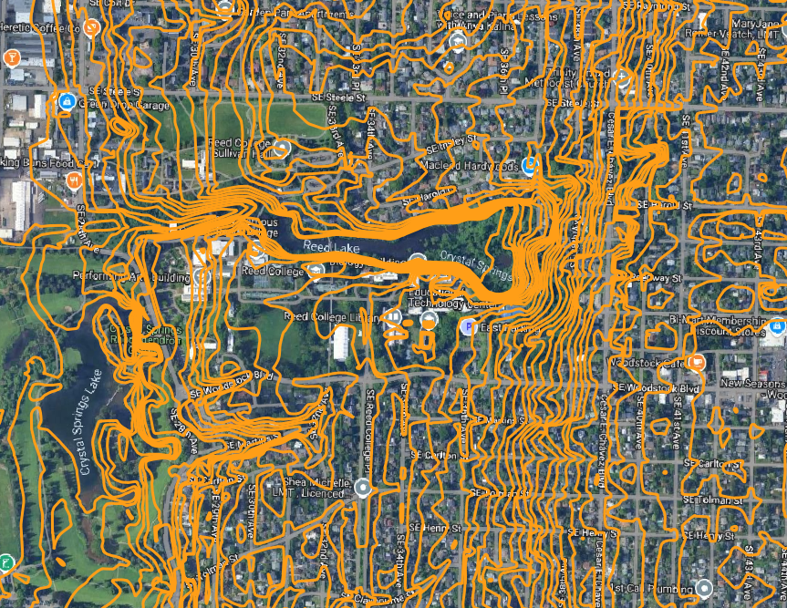
I wanted an area around Reed, not just Reed itself, so I added a rectangular polygon around the area I wanted. I set it to be white and moved it behind the contour lines.
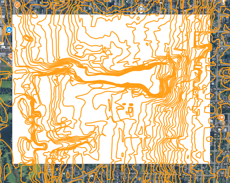
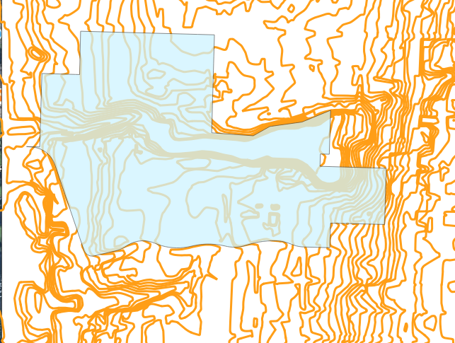
Because I wanted to include Reed College on my map, I also downloaded another shape file that included names and boundaries for different tax lots in Portland. I opened that as a layer in QGIS and filtered the names to just find the boundary of Reed College and remove all other tax lots. Then I overlaid this Reed layer onto the map.
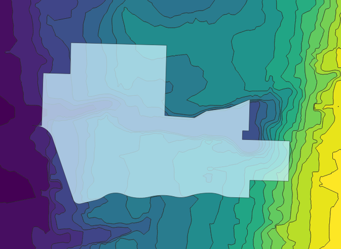
Then I converted the contour lines into polygons so that they could be shaded in by elevation height. There’s a tool in QGIS called “Contour Polygons” that will do this for you. Then I changed the symbology of that layer so that every five feet difference in elevation appeared as a different color along a gradient. I chose five feet because that is the resolution of the original contour file, but I could have chosen a higher number for a less fine-grained graphic.
Lastly, I wanted to add some roads so that it would be easier to orient oneself. QGIS has a Open Streets Map plugin that allows you to add all kinds of things like bike lanes, horse paths, stop lights, and more. From that layer, I selected the streets that I wanted to add to my map. Then I fiddled with the coloring a bit to make things more legible.
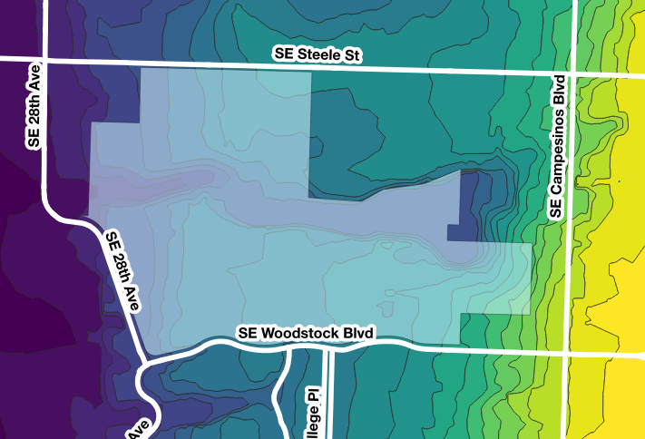
To determine that the height of the Woodstock hill is 240 feet, I used the “identify features” tool to see the information for the contour line that overlapped 39th street.
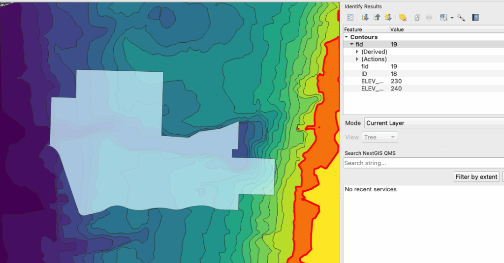
I did the same for an area on the quad. I identified the quad by adding on a layer of Reed buildings, but I thought the map looked too busy with those included, so I removed them for the final graphic. The point of my graphic was to look at the steepness of the Woodstock hill, so the buildings distracted rather than added to the map.