
This week our main goal has been to find a pipeline to obtain TCGA data in a neat form. We discovered UCSC’s Xena Browser, which has files from the TCGA and a number of other databases.
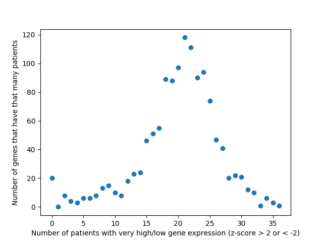
Last week, we used the data from FireBrowse to make a graph of the genes that have patients with abnormally high or low levels of expression.
This week we changed that graph slightly by showing the difference between the number of patients with high expression and the number of patients with low expression by gene.
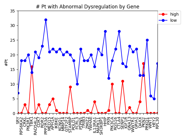
It is interesting to me that there are generally more patients with severe under-expression rather than severe-overexpression. I wonder if this is because these genes play a role in suppressing tumors, and that therefore maybe under-expression is more likely to cause cancer than overexpression?
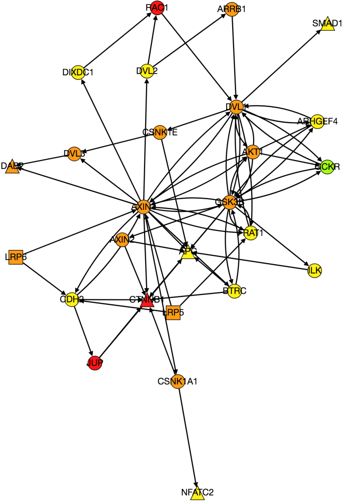
I also worked on integrating gene expression data from Xena into our graph of the Wnt pathway.
Kathy figured out what was wrong with PathLinker the first time we ran it and re-ran it. I am working on turning it into a graph, but the input data is very different because it’s coming from a different version of NetPath so I need to change the program to be able to process the new data.
I also noticed while I was processing the expression data from Xena that there was a large amount of variability in gene expression between patients. I’m currently working on several things. Instead of just averaging gene expression for genes I’m comparing gene expression patient-by-patient so I’m comparing a tumor sample to a normal tissue sample for every patient. I also want to come up with a way to visualize the variance of expression among patients, because the more variance there is the less significant differences in expression between cancerous and normal tissue are. Anna suggested I do this by making the borders on nodes with high variance thicker. I am also going back and checking my math on gene expression to make sure that it is actually statistically significant and is conducted in a way that is similar to how other researchers have done similar research in the past.