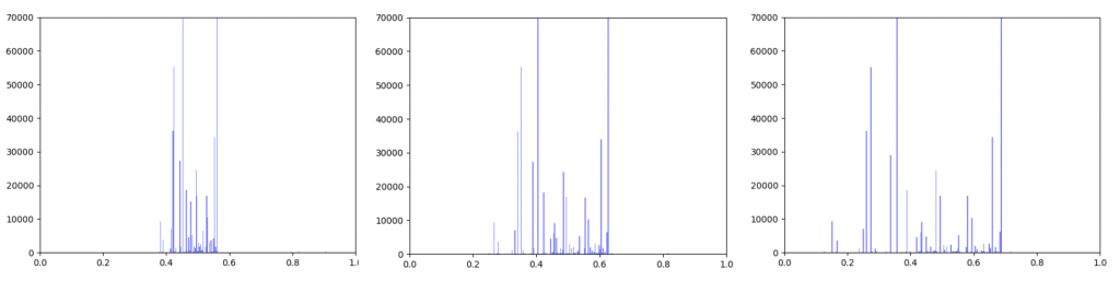
Anna and Ibrahim came up with two new ways to weight the nodes, both of which have produced a far greater range of nodeweights than the original nodescoring.py program did. The histograms for the new node weights are as below:
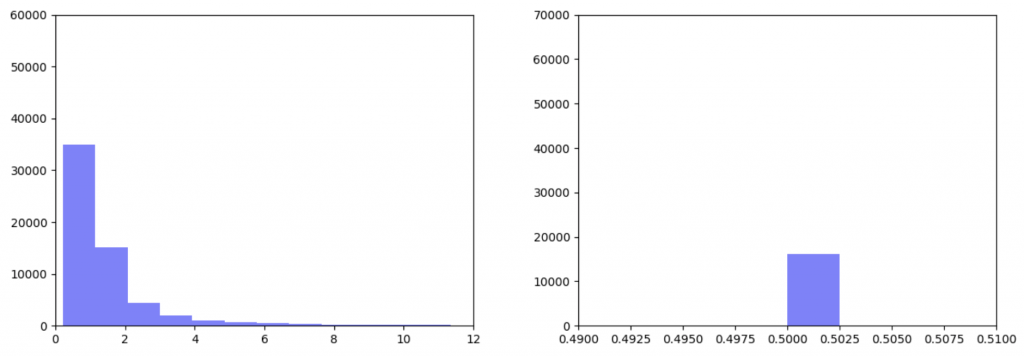
In my last blog post, I talked about how I was concerned about how small the range of normalized node scores is. This week I’ve been trying to figure out why that is. To do this I’ve been making histograms of each step of the process from foldchange to Xv to Cv. This is an example of that process for one gene:
Distribution of foldchanges across patient samples for a single gene.Distribution of Xvs across patient samples for a single gene
The Cv of the gene above was 0.5000000003. Unfortunately, it looks like a lot of genes even with fairly different fold change and Xv distributions end up with very similar Cvs.
Ibrahim realized that this is occurring because there is an error in the equations we were using so we will have to rethink the way we normalize the data.
This week Kathy, Usman and I met to discuss how we would combine the projects we’ve been working on into a cohesive pathway and how we would analyze the output of CancerLinker as compared to PathLinker.
I have been working on ways to visualize the data. One thing I wanted to look at was how incorporating gene expression data would change the overall distribution of edge weights in the interactome.
The original interactome has a reasonable distribution with two values that seem to appear frequently around 0.4 and 0.8.
Original Interactome
Gene expression data was incorporated into the original interactome with a beta value. The beta value determines the weight of the original edge weight when including the gene expression data. So the higher the beta score, the lower the importance of the gene expression data. I made three histograms one for a beta=0.25, one for beta = 0.5 (equal contribution between original edge weight and gene expression data) and one for 0.75
Distribution of edge weights with gene expression incorporated. Left B=0.25, Middle B=0.5, Right B=0.75
As can be seen in the histograms above, when gene expression data is weighted more heavily, edges weights are more closely clustered. To investigate why this occurred I made two additional histograms: one of the gene expression data before it was transformed and one of the gene expression data after it was transformed.
Left: Gene expression data before transformation Right: Gene expression data after being transformed
After the gene expression data is transformed, there is extremely little variation. Additionally all the gene expression data is greater than or equal to 0.5 which should be the median. This would explain why weighting the gene expression data more heavily causes more closely-clustered edge weights. I’m not sure how to fix this. It seems like an error, but I’ve been over the code multiple times and the math seems right to me. So my next step is to figure out what’s going on there.
In the meantime I took the output from the pipeline that Kathy put together and put graphs for the top 1000 Wnt paths with β=0.25, 0.5 and 0.75 up on GraphSpace. If I figure out what’s wrong with the function that transforms the edgeweights, I will run it again and re-upload the updated graphs.
I have spent most of this week trying to transform the gene expression data and implement the equations that Ibrahim came up with to incorporate gene expression data onto edge scores.
I have had several major hold-ups to accomplishing this. The first is pretty simple, I just don’t know how to get the kind of data output I want from the CDF function because the scipy.norm.cdf() function outputs an array and I want a single value for each node.
The biggest issue is that the TCGA data on gene expression and PathLinker use different gene nomenclature systems. The TCGA relies on Ensembl IDs whereas PathLinker relies on UniProt IDs. Originally I tried to convert all the Ensembl IDs to common names to UniProt IDs because I have a file that contains UniProt IDs and common names, and another file that contains Ensembl IDs and common names. However, this didn’t work because a single gene may have multiple common names and may refer to multiple UniProt IDs (for example there are about 20 UniProt IDs that correspond to the HLA-A gene).
Therefore, to avoid the loss of data due to various common names, I tried to make a dictionary of Ensembl IDs directly to UniProt IDs. I was able to obtain a file that contained both UniProt and Ensembl IDs from the HUGO Gene Nomenclature Committee website. However, converting between Ensemble and UniProt came with its own problems. First of all, there are many genes that either only have UniProt IDs or only have Ensembl IDs. 997 genes in the interactome were unable to be converted from one to the other because of this reason. In addition, many of the Ensembl IDs in the TCGA file (over 16,000) don’t line up with any of the Ensembl IDs in the dictionary I constructed. I think this might be because the Ensembl IDs in the TCGA file include version numbers at the end of each ID. The version number is the decimal point at the end of the ID name. For example for the gene, “ENSG00000242268.2”, the “.2” means that this is the 2nd version of that gene. I think one way to fix this problem might be to just take all the version numbers out of the gene name when constructing the dictionary from the TCGA file. However, I can’t figure out how to do this without making the code super slow. If every version number were a single decimal place (ie: .1, .2, .3 … etc), I would just cut off the last two digits of each name which wouldn’t be that slow. However different IDs have different number of decimal places. For example, if I cut off the last two digits of “ENSG00000167578.15” I would still be left with the decimal point. Therefore the only way I can currently think of to get rid of the decimal and everything following it is to use a for-loop that goes through every character in the name and if the character is a decimal point to cut the string there. However, if the program has to go through every letter in every gene name, it’s going to be extremely slow. Maybe something I could do is pre-process the data to create a text file that contains gene IDs without the decimal places so it only has to do it one time and won’t slow the whole code down, but I feel like there has to be a faster way to do it within the program.
This week we spent most of our time attending and volunteering at GCC/BOSC (Galaxy Community Conference/ Bioinformatics Open Source Conference). While the conference wasn’t extremely relevant to what we’re working on right now, we learned how to use software like Galaxy and Intermine, which might be useful to us in future projects. Also, this was the first conference I’ve ever attended so it was very interesting to learn how conferences work and to meet people.
This week I have continued trying to visualize and integrate gene expression data from GDC TCGA onto nodes in Graphspace. This is the graph I have so far:
The color of the nodes on the graph represent the mean foldchange of the gene. The foldchange is the ratio of gene expression of a cancerous tissue sample to a normal tissue sample from the same patient. There were 41 patients with colon adenocarcinoma who had gene expression data from both a tumor and a normal sample. The foldchange for each of these 41 patients was averaged to find the mean foldchange of each gene. Light blue indicates that the gene is slightly underexpressed in cancerous samples (less than 1 standard deviation), dark blue(not shown) indicates that the gene is underexpressed by 2 standard deviations, purple (not shown) indicates that the gene is underexpressed by greater than 2 standard deviations. Orange indicates that the gene is slightly overexpressed (within one standard deviation), dark orange indicates that the gene is overexpressed by 2 standard deviations, and red indicates that the gene is overexpressed by greater than 2 standard deviations.
One problem that came up was that some genes have a lot more variance in patient data than others. (Data on variance is available by clicking on the nodes in Graphspace). Additionally, patients that no gene expression or close to no gene expression in their normal samples had extremely high foldchanges that threw off the mean. It’s tempting to just throw away those samples as outliers, however several samples had multiple “outliers”. As an example I’ve included three sets of line graphs I made that show the gene expression data and foldchange of each patient for three different genes:
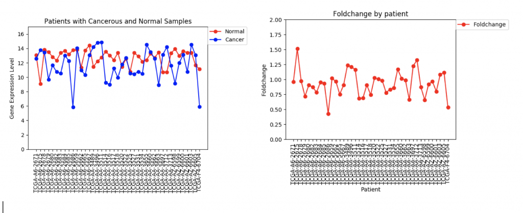
CFTR Expression and Foldchange Line Graphs for 41 patients
In the first example, CFTR, one can see that cancerous samples tend to have lower gene regulation than healthy samples and most of the fold change values hover around 1.0, meaning that the change is fairly low.
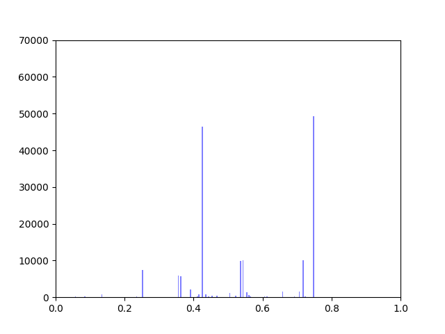
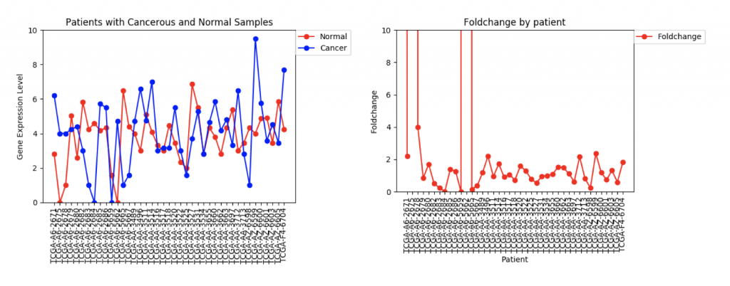
FZD9 Gene expression and foldchange for 41 patients
The second example, FZD9, is slightly different. The FZD9 expression data is much less uniform. In some patients, FZD9 is largely overregulated in cancerous samples. In other, it’s largely under regulated. The foldchange data shows foldchanges that range from zero to extremely high values (greater than 30,0000). This occurs because those patients had normal sample values of 0.0. In this case, it looks like dismissing the two extremely high foldchanges as outliers would yield a more realistic data set.
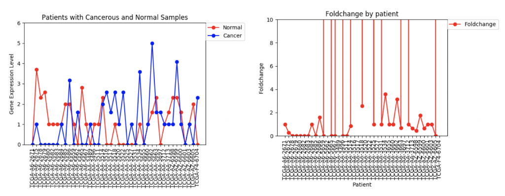
ZSCAN4 Gene Expression and Foldchanges
However, in ZSCAN4, there are many patients with extremely high or low foldchanges. Instead of ignoring these patients, I think I need to find a way to normalize the data so that a few large foldchanges don’t completely throw off the data.
The next step in this project is to work with Usman and Kathy to integrate the gene expression data onto the edge weights so that PathLinker can calculate the most disregulated protein pathways. To begin this process, I’ve written a program that produces a text file that contains for each gene the ID, common name, mean foldchange, standard deviation, and either a +1, 0, or -1, which represents whether it’s under-regulated, unchanged, or over-regulated in cancerous samples. Right now the +1, 0, and -1 are really just placeholder values. I need to meet with Ibrahim and Anna to discuss how to better weight the nodes.
This week our main goal has been to find a pipeline to obtain TCGA data in a neat form. We discovered UCSC’s Xena Browser, which has files from the TCGA and a number of other databases.
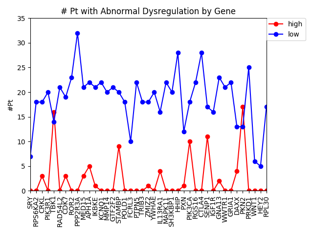
Last week, we used the data from FireBrowse to make a graph of the genes that have patients with abnormally high or low levels of expression.
Number of patients that have abnormally high or low levels of expression
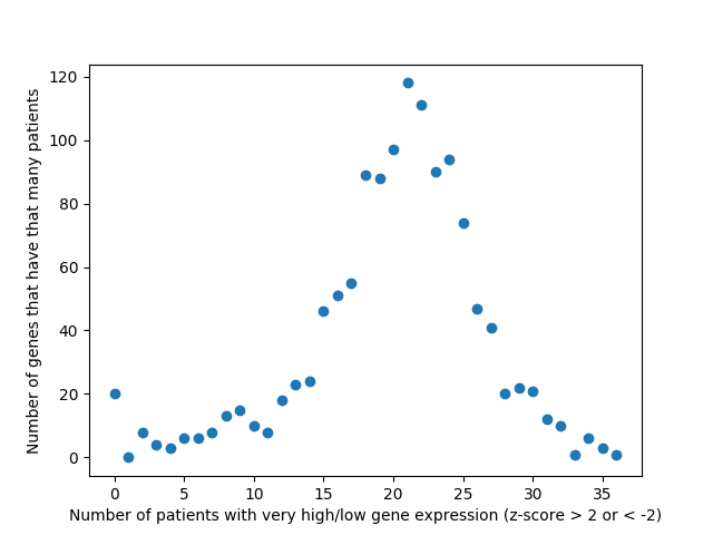
This week we changed that graph slightly by showing the difference between the number of patients with high expression and the number of patients with low expression by gene.
Number of patients by gene that have abnormally high or abnormally low levels of gene expression.
It is interesting to me that there are generally more patients with severe under-expression rather than severe-overexpression. I wonder if this is because these genes play a role in suppressing tumors, and that therefore maybe under-expression is more likely to cause cancer than overexpression?
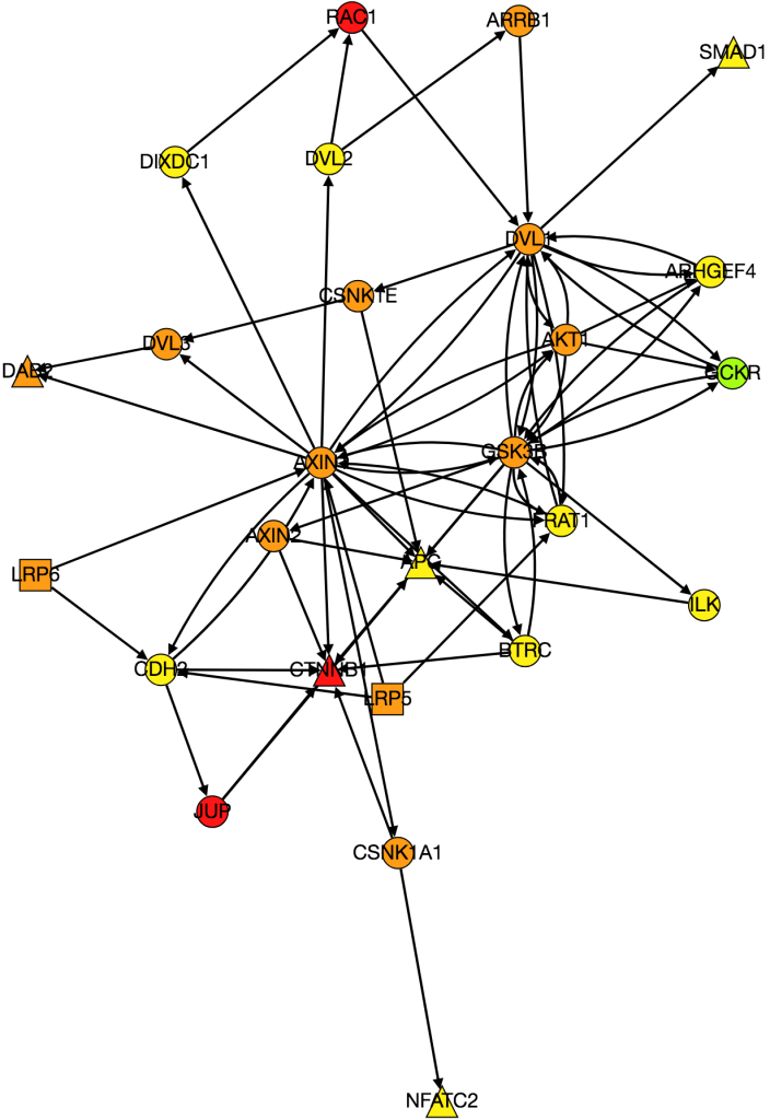
I also worked on integrating gene expression data from Xena into our graph of the Wnt pathway.
Wnt Pathway from PathLinker with Gene Expression Data. Red = high, orange = medium-high, yellow= medium, green = low, blue(not shown) = very low, white(not shown) = no expression. Triangles are transcription factors, squares are receptors, circles are intermediate proteins.
Kathy figured out what was wrong with PathLinker the first time we ran it and re-ran it. I am working on turning it into a graph, but the input data is very different because it’s coming from a different version of NetPath so I need to change the program to be able to process the new data.
I also noticed while I was processing the expression data from Xena that there was a large amount of variability in gene expression between patients. I’m currently working on several things. Instead of just averaging gene expression for genes I’m comparing gene expression patient-by-patient so I’m comparing a tumor sample to a normal tissue sample for every patient. I also want to come up with a way to visualize the variance of expression among patients, because the more variance there is the less significant differences in expression between cancerous and normal tissue are. Anna suggested I do this by making the borders on nodes with high variance thicker. I am also going back and checking my math on gene expression to make sure that it is actually statistically significant and is conducted in a way that is similar to how other researchers have done similar research in the past.
On Monday we all met with Anna to agree on some goals for the week. Kathy and I set out to acheive several things: A. to figure out how to download data from FireBrowse on colon adenocarcinomas, to perform several statistical analyses on that data and to visualize it in some form using pylab, B. to write a code that produced informative graphs of the different signaling pathways from text files containing information about the edges and nodes and C. to implement PathLinker and LocPL and to create graphs of the top k paths on GraphSpace.
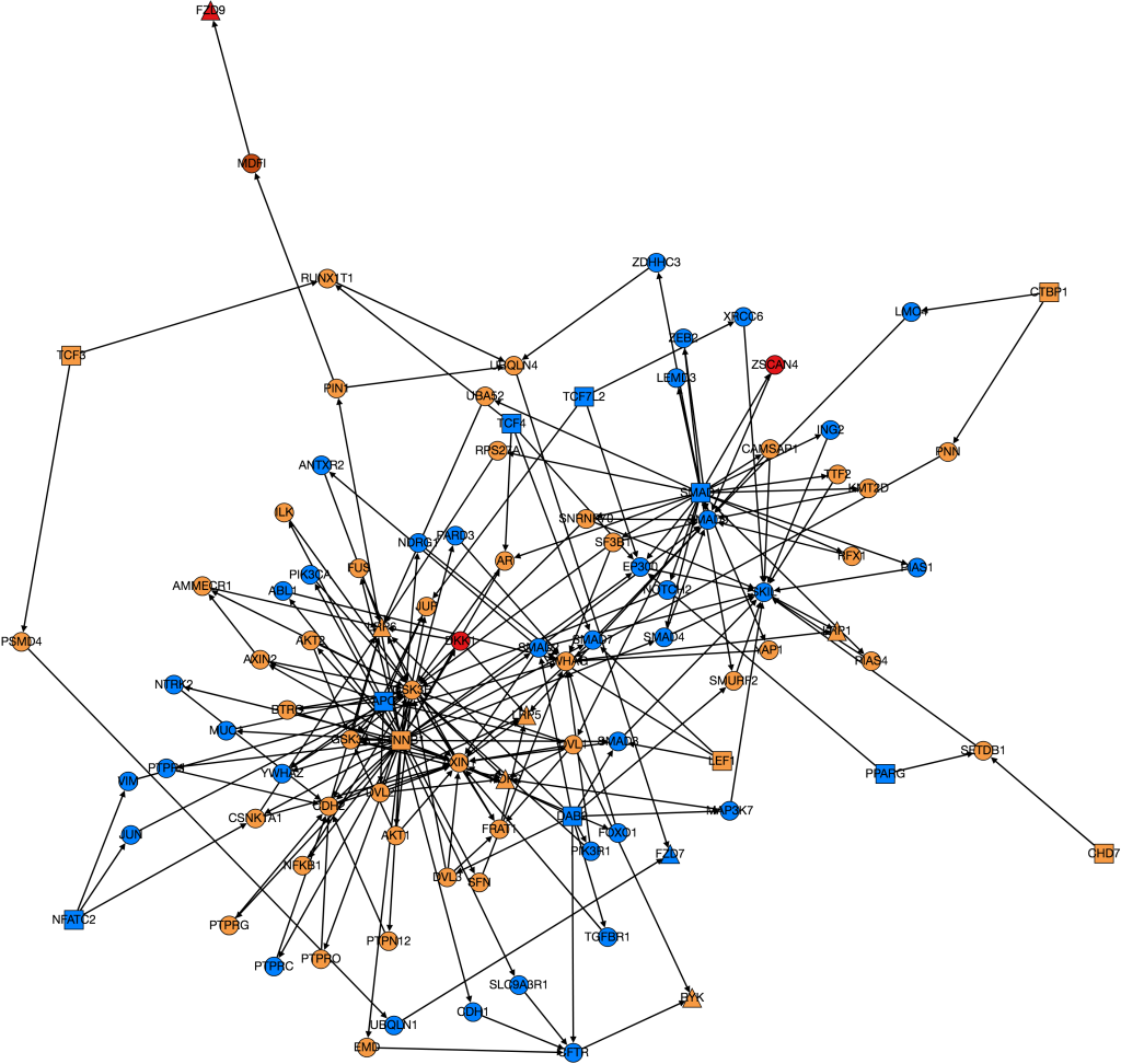
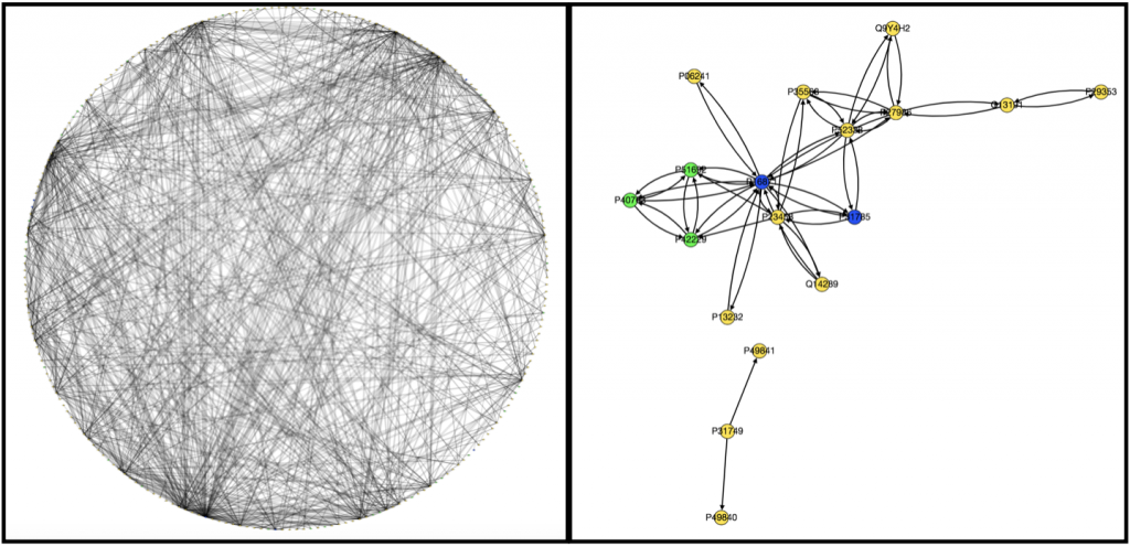
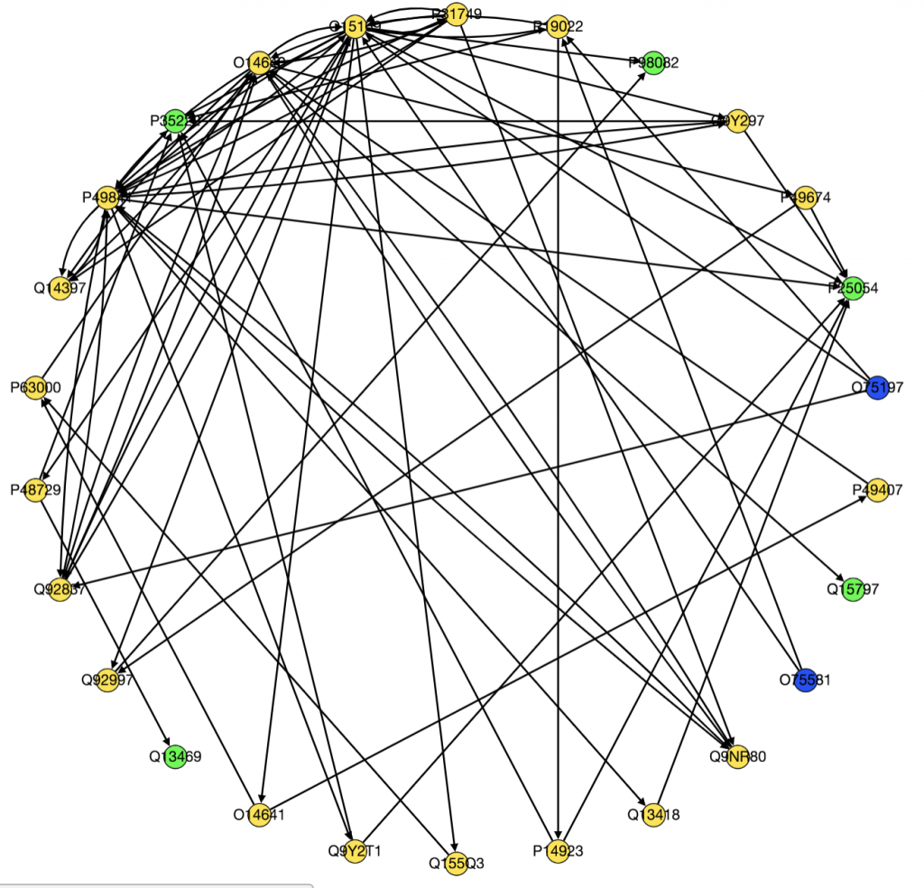
Originally to acheive our first goal, we tried to use Nicholas Egan’s pepper pathway code to download and format the data. However, while we were able to decipher how it worked, it ended up not being all that useful to us, so Kathy downloaded all the gene files related to colon adenocarcinoma onto her computer . Unfortunately, we’re still not really sure how to use them. We wrote a code that took text files containing information on edges and nodes and spit out a graph with color-coded nodes that were labeled with the node name and type and edges that were labeled with the type of interaction that was occuring between the two nodes for example “physical” or “phosphorylation”. I have attached to examples of the graphs we produced below, one very complex and the other very simple.
Moving forward we have several goals. Kathy is trying to figure out how to implement LocPL. I am still trying to figure out how to process and use the FireBrowse data. Because I will need to integrate methylation data from FireBrowse in my project, it is essential I figure out how to use it.
Overall, this week I have learned a lot about data processing, writing code to read text files, and using NetPath, PathLinker, FireBrowse, and GraphSpace. These skills should come in handy as I move forward in my project.
This week, Kathy, Usman, and I split up to learn more about different aspects of PathLinker. I researched the Wnt/β-catenin signaling pathway, precision-recall curves, and the role of CFTR and Dab2. On Wednesday, we all presented the topics we had researched to each other and Anna and Ibrahim.
To briefly summarize what I learned, the Wnt/β-catenin pathway regulates the transcription of certain genes related to cell proliferation, cell attachment, and growth. When the Wnt/β-catenin signaling pathway is dysregulated, a number of pathologies can develop including cancer and heart disease. In fact, in a study on colon adenocarcinoma by the Cancer Genome Atlas, 93% of tested tumors had a mutation that affected the Wnt/β-catenin signaling pathway (TCGA, 2012). At the most basic level theWnt/β-catenin signaling pathway is turned on when Wnt proteins bind to “frizzled” a 7-pass transmembrane receptor which halts the destruction of β-catenin in the cell. Usually, when the pathway is off, β-catenin is constantly being produced and destroyed. When β-catenin destruction is interrupted, β-catenin will build up in the cytoplasm and move into the nucleus where it will bind to LEF and the TCF promoter to promote the transcription of specific genes that were previously being inhibited by a transcription factor that was bound to TCF. The Wnt/β-catenin signaling pathway involves many proteins and interactions, some of which we still do not understand. The PathLinker algorithm succesfully identified a path in the Wnt/β-catenin signaling pathway that was not in the KEGG or NetPath database: the Ryk-CFTR-Dab2 path (Ritz et al, 2016). The authors of the paper hypothesized that Ryk would interact with CFTR (Cystic Fibrosis Transmembrane-conductance Regulator), a chlorine ion channel previously studied for its role in cystic fibrosis, which would activate Dab2 to inhibit β-catenin activity. This hypothesis was experimentally confirmed by silencing Ryk, CFTR and Dab2 individually using RNA interference and then testing transcription levels of β-catenin controlled genes using a TCF/LEF luciferase activity and levels of β-catenin in the cell using a Western Blot assay.
We also attended a data management workshop taught by David Isaak, Reed’s data science librarian to learn how to use Git and GitHub. Because I’ve never really used terminal before (I usually use repl.it), I worked through a command line tutorial to learn more about it.
On Thursday, Kathy, Usman, and I went through our Dijkstra code with Anna, and finally got it to work the way we wanted it to. Anna added us to the cancer-linker repository on GitHub so we can all begin to actually work on PathLinker now.
My next project is to figure out how to take data from FireBrowse, a database containing data from TCGA on 38 different cancer types, put it into a format we can use, and apply several statistical analyses to the information. I’m hoping to base it off of PepperPathway, a program written by Nicholas Egan, a student in Anna’s lab last summer, that uses data from FireBrowse, GeneCards and NetPath and to create a visual representation on GraphSpace. I’m struggling to make sense of the PepperPathway program because there are a lot of files on the GitHub repository and I’m not really sure where to begin. I’m going to try to make sense of it this weekend.
References
TCGA Research Network. Comprehensive Molecular Characterization of Human Colon and Rectal Tumors. July 19, 2012. Nature. DOI: 10.1038/nature11252.
Ritz, Anna et al. “Pathways on Demand: Automated Reconstruction of Human Signaling Networks.” Npj Systems Biology And Applications 2 (2016): 16002. Web.
This is Kathy, Usman, and my first week working on our summer research projects which all involve modifying the PathLinker algorithm. For my project, I am interested in integrating data about protein methylations related to colon adenocarcinoma from the FireBrowse database into PathLinker. Protein methylation, which is only one of many ways that cell signaling pathways can be altered in cancerous cells, can either inhibit or enhance protein-protein interactions. I intend to devise a way to use this information to change the weights of edges connected to methylated proteins to more accurately model cancerous cell signaling pathways. I am hoping this method could eventually be generalized so that the algorithm could be modified for multiple types of cancerous mutations. I believe that this work could be important in identifying important proteins for further research.
So far, we have mostly been trying to learn about pathway reconstruction methods before we dive in. To do this, we have been re-reading the original PathLinker paper as well as a more recent paper about an alteration to PathLinker that allows it to integrate protein localization information.
We have also been working on understanding and implementing two algorithms that calculate the shortest path from a source to a target in a graph: Breadth First Search and Dijkstra’s algorithm. Breadth-first search is an algorithm that finds the path with the fewest number of edges from a source to a target. Dijkstra is more advanced and relative to our work because it takes the weight of the edges between nodes into account. Dijkstra will find the path with the lowest sum of edge weights from the source to any node in the graph.
This weekend and this coming week I have several goals. Primarily, Usman, Kathy and I need to figure out how to get the separate pieces of code that we wrote for the Dijkstra algorithm (which all work individually) to work together to first read a text file, then run Dijkstra’s algorithm, and finally produce a visual graph that shows the best paths. I need to do more research about the original PathLinker to gain a better understanding of precision-recall curves which were used to evaluate its efficacy, Ryk-CFTR-Dab2, which is a new path that was discovered in the Wnt/β-catenin signaling pathway by PathLinker, and the experimental methods that were used to verify the importance of CFTR.