Anna and Ibrahim came up with two new ways to weight the nodes, both of which have produced a far greater range of nodeweights than the original nodescoring.py program did. The histograms for the new node weights are as below:
In my last blog post, I talked about how I was concerned about how small the range of normalized node scores is. This week I’ve been trying to figure out why that is. To do this I’ve been making histograms of each step of the process from foldchange to Xv to Cv. This is an example of that process for one gene:
Distribution of foldchanges across patient samples for a single gene.Distribution of Xvs across patient samples for a single gene
The Cv of the gene above was 0.5000000003. Unfortunately, it looks like a lot of genes even with fairly different fold change and Xv distributions end up with very similar Cvs.
Ibrahim realized that this is occurring because there is an error in the equations we were using so we will have to rethink the way we normalize the data.
This week, I’ve been creating a tabular file with all TCGA-COAD samples at the top of the file as column names, with genes at the sides. I should have a 512 x 60484 matrix file when done. However, with Sol’s help I realized that the file I initially output was actually 512 samples at the top, with only 443 columns after, but still with 60484 lines to the file.
Therefore, I think there’s something wrong in how I’m categorizing/organizing the samples.
This week Kathy, Usman and I met to discuss how we would combine the projects we’ve been working on into a cohesive pathway and how we would analyze the output of CancerLinker as compared to PathLinker.
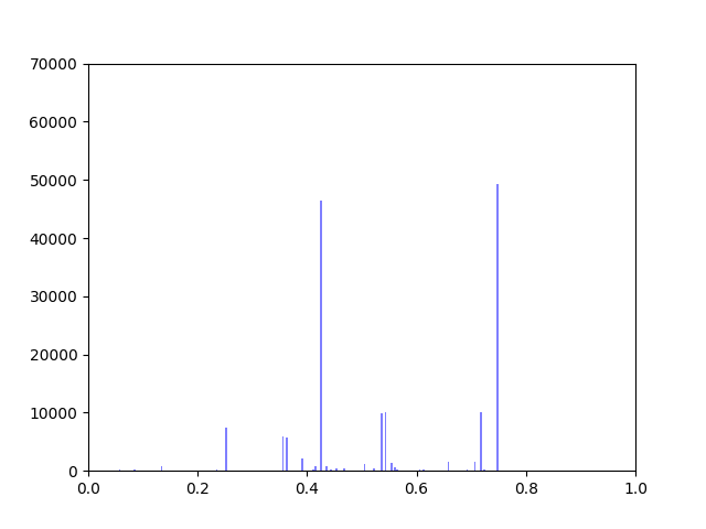
I have been working on ways to visualize the data. One thing I wanted to look at was how incorporating gene expression data would change the overall distribution of edge weights in the interactome.
The original interactome has a reasonable distribution with two values that seem to appear frequently around 0.4 and 0.8.
Original Interactome
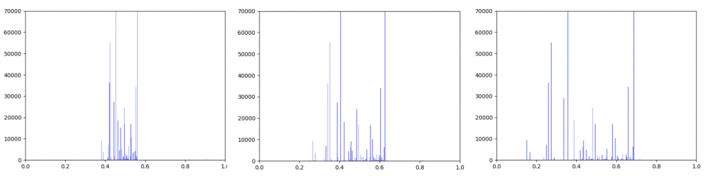
Gene expression data was incorporated into the original interactome with a beta value. The beta value determines the weight of the original edge weight when including the gene expression data. So the higher the beta score, the lower the importance of the gene expression data. I made three histograms one for a beta=0.25, one for beta = 0.5 (equal contribution between original edge weight and gene expression data) and one for 0.75
Distribution of edge weights with gene expression incorporated. Left B=0.25, Middle B=0.5, Right B=0.75
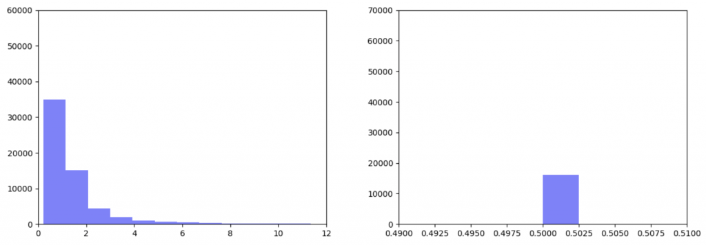
As can be seen in the histograms above, when gene expression data is weighted more heavily, edges weights are more closely clustered. To investigate why this occurred I made two additional histograms: one of the gene expression data before it was transformed and one of the gene expression data after it was transformed.
Left: Gene expression data before transformation Right: Gene expression data after being transformed
After the gene expression data is transformed, there is extremely little variation. Additionally all the gene expression data is greater than or equal to 0.5 which should be the median. This would explain why weighting the gene expression data more heavily causes more closely-clustered edge weights. I’m not sure how to fix this. It seems like an error, but I’ve been over the code multiple times and the math seems right to me. So my next step is to figure out what’s going on there.
In the meantime I took the output from the pipeline that Kathy put together and put graphs for the top 1000 Wnt paths with β=0.25, 0.5 and 0.75 up on GraphSpace. If I figure out what’s wrong with the function that transforms the edgeweights, I will run it again and re-upload the updated graphs.
I have spent most of this week trying to transform the gene expression data and implement the equations that Ibrahim came up with to incorporate gene expression data onto edge scores.
I have had several major hold-ups to accomplishing this. The first is pretty simple, I just don’t know how to get the kind of data output I want from the CDF function because the scipy.norm.cdf() function outputs an array and I want a single value for each node.
The biggest issue is that the TCGA data on gene expression and PathLinker use different gene nomenclature systems. The TCGA relies on Ensembl IDs whereas PathLinker relies on UniProt IDs. Originally I tried to convert all the Ensembl IDs to common names to UniProt IDs because I have a file that contains UniProt IDs and common names, and another file that contains Ensembl IDs and common names. However, this didn’t work because a single gene may have multiple common names and may refer to multiple UniProt IDs (for example there are about 20 UniProt IDs that correspond to the HLA-A gene).
Therefore, to avoid the loss of data due to various common names, I tried to make a dictionary of Ensembl IDs directly to UniProt IDs. I was able to obtain a file that contained both UniProt and Ensembl IDs from the HUGO Gene Nomenclature Committee website. However, converting between Ensemble and UniProt came with its own problems. First of all, there are many genes that either only have UniProt IDs or only have Ensembl IDs. 997 genes in the interactome were unable to be converted from one to the other because of this reason. In addition, many of the Ensembl IDs in the TCGA file (over 16,000) don’t line up with any of the Ensembl IDs in the dictionary I constructed. I think this might be because the Ensembl IDs in the TCGA file include version numbers at the end of each ID. The version number is the decimal point at the end of the ID name. For example for the gene, “ENSG00000242268.2”, the “.2” means that this is the 2nd version of that gene. I think one way to fix this problem might be to just take all the version numbers out of the gene name when constructing the dictionary from the TCGA file. However, I can’t figure out how to do this without making the code super slow. If every version number were a single decimal place (ie: .1, .2, .3 … etc), I would just cut off the last two digits of each name which wouldn’t be that slow. However different IDs have different number of decimal places. For example, if I cut off the last two digits of “ENSG00000167578.15” I would still be left with the decimal point. Therefore the only way I can currently think of to get rid of the decimal and everything following it is to use a for-loop that goes through every character in the name and if the character is a decimal point to cut the string there. However, if the program has to go through every letter in every gene name, it’s going to be extremely slow. Maybe something I could do is pre-process the data to create a text file that contains gene IDs without the decimal places so it only has to do it one time and won’t slow the whole code down, but I feel like there has to be a faster way to do it within the program.
This week, I discovered how to download files from the TCGA database, and explored their structure.
So this week, I downloaded 512 files relating to colorectal cancer (COAD in the TCGA database.) These were compressed into a Tar file, which opened into a directory tree that looked like this:
Each tiny blue dot is a folder, and inside each folder is one gzipped file (compressed). And each one of these files is a sample from a patient with gene, and its expression (from either a tumor sample or a healthy one.)
So my main issue has been to try and parse these files into a data matrix, ideally with sample-ids on the top and gene expression on the sides. So far, I’ve been able to compress these files into patient and samples relating to them because ideally, we want to look at gene expression in a healthy and tumor sample from the same patient. However, I haven’t been able to write the sample-ids with gene expression data into a file because of multiple bugs and errors. My goal for next week is to get these errors fixed.
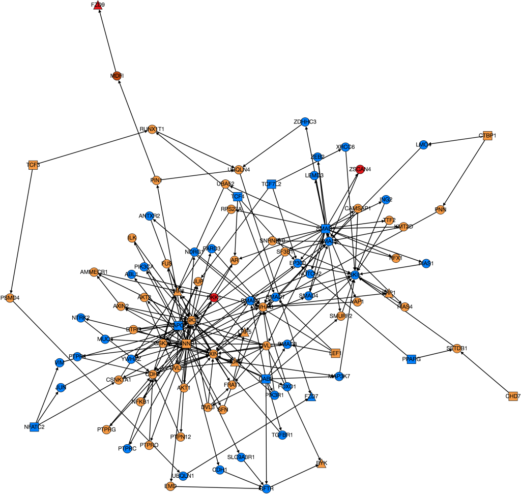
This week I have continued trying to visualize and integrate gene expression data from GDC TCGA onto nodes in Graphspace. This is the graph I have so far:
The color of the nodes on the graph represent the mean foldchange of the gene. The foldchange is the ratio of gene expression of a cancerous tissue sample to a normal tissue sample from the same patient. There were 41 patients with colon adenocarcinoma who had gene expression data from both a tumor and a normal sample. The foldchange for each of these 41 patients was averaged to find the mean foldchange of each gene. Light blue indicates that the gene is slightly underexpressed in cancerous samples (less than 1 standard deviation), dark blue(not shown) indicates that the gene is underexpressed by 2 standard deviations, purple (not shown) indicates that the gene is underexpressed by greater than 2 standard deviations. Orange indicates that the gene is slightly overexpressed (within one standard deviation), dark orange indicates that the gene is overexpressed by 2 standard deviations, and red indicates that the gene is overexpressed by greater than 2 standard deviations.
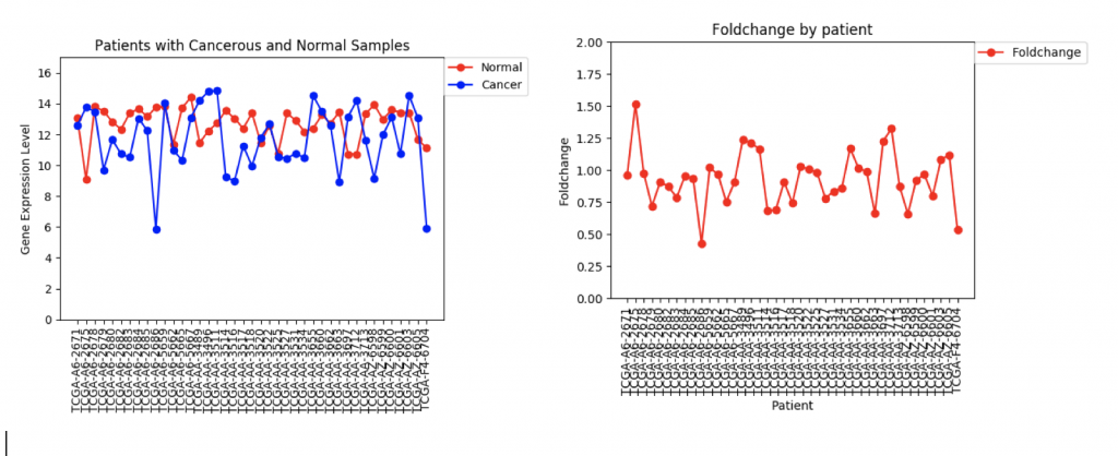
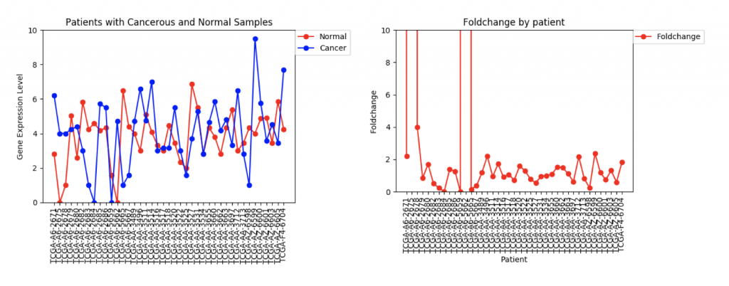
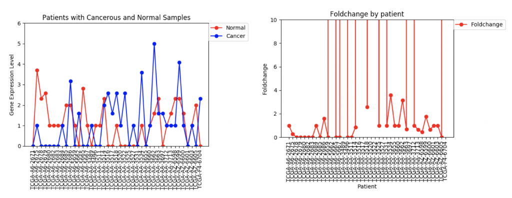
One problem that came up was that some genes have a lot more variance in patient data than others. (Data on variance is available by clicking on the nodes in Graphspace). Additionally, patients that no gene expression or close to no gene expression in their normal samples had extremely high foldchanges that threw off the mean. It’s tempting to just throw away those samples as outliers, however several samples had multiple “outliers”. As an example I’ve included three sets of line graphs I made that show the gene expression data and foldchange of each patient for three different genes:
CFTR Expression and Foldchange Line Graphs for 41 patients
In the first example, CFTR, one can see that cancerous samples tend to have lower gene regulation than healthy samples and most of the fold change values hover around 1.0, meaning that the change is fairly low.
FZD9 Gene expression and foldchange for 41 patients
The second example, FZD9, is slightly different. The FZD9 expression data is much less uniform. In some patients, FZD9 is largely overregulated in cancerous samples. In other, it’s largely under regulated. The foldchange data shows foldchanges that range from zero to extremely high values (greater than 30,0000). This occurs because those patients had normal sample values of 0.0. In this case, it looks like dismissing the two extremely high foldchanges as outliers would yield a more realistic data set.
ZSCAN4 Gene Expression and Foldchanges
However, in ZSCAN4, there are many patients with extremely high or low foldchanges. Instead of ignoring these patients, I think I need to find a way to normalize the data so that a few large foldchanges don’t completely throw off the data.
The next step in this project is to work with Usman and Kathy to integrate the gene expression data onto the edge weights so that PathLinker can calculate the most disregulated protein pathways. To begin this process, I’ve written a program that produces a text file that contains for each gene the ID, common name, mean foldchange, standard deviation, and either a +1, 0, or -1, which represents whether it’s under-regulated, unchanged, or over-regulated in cancerous samples. Right now the +1, 0, and -1 are really just placeholder values. I need to meet with Ibrahim and Anna to discuss how to better weight the nodes.
I spent this week developing an understanding of the command line and version control, as well as exploring the data gathered from the TCGA cancer genome data.
First, I discovered that an application I had downloaded to make my life easier (Anaconda) had deleted python 2.7 from my machine and wouldn’t allow me to run things appropriately. This was a huge problem because currently, I need to run programs using python 2.7 and networkx 1.9.1 for dependencies to work out. So, I deleted the installation files and made sure that all of the caches and file folders they resided in were deleted, and then used Homebrew to reinstall python 2 and python 3. The moral of this story is to always understand what you’re installing.
Secondly, I developed the framework for the bar graph that we will eventually use to analyze which genes are present in each of the datasets we are looking at. We are measuring the number of genes with different levels of gene expression(high, low, or none) in each of the datasets that we have. Each dataset will then have 3 different bars expressing this data.
We’ll be using the TCGA Genes database, the number of genes from the PathLinker-2015 interactome, PathLinker-2018 interactome, the Wnt Pathway from NetPath, the PathLinker-2015 interactome’s top 1000 paths, the PathLinker-2018 interactome’s top 1000 paths, and finally the Localized PathLinker-2015 interactome’s top 1000 paths, as well as the Loc_PL 2018 interactome’s top 1000 paths.
This week our main goal has been to find a pipeline to obtain TCGA data in a neat form. We discovered UCSC’s Xena Browser, which has files from the TCGA and a number of other databases.
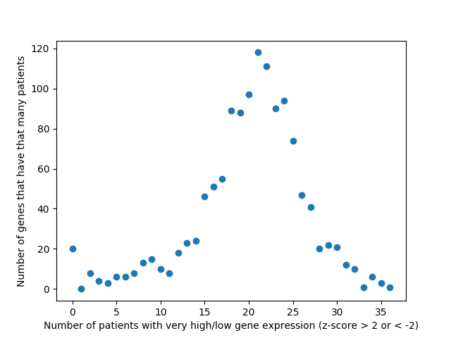
Last week, we used the data from FireBrowse to make a graph of the genes that have patients with abnormally high or low levels of expression.
Number of patients that have abnormally high or low levels of expression
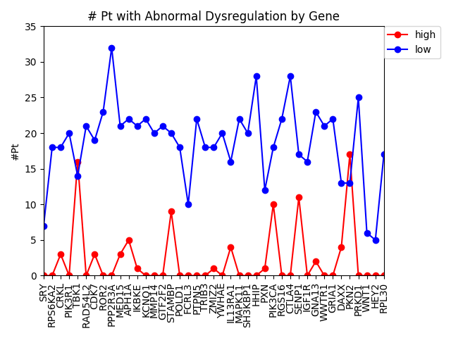
This week we changed that graph slightly by showing the difference between the number of patients with high expression and the number of patients with low expression by gene.
Number of patients by gene that have abnormally high or abnormally low levels of gene expression.
It is interesting to me that there are generally more patients with severe under-expression rather than severe-overexpression. I wonder if this is because these genes play a role in suppressing tumors, and that therefore maybe under-expression is more likely to cause cancer than overexpression?
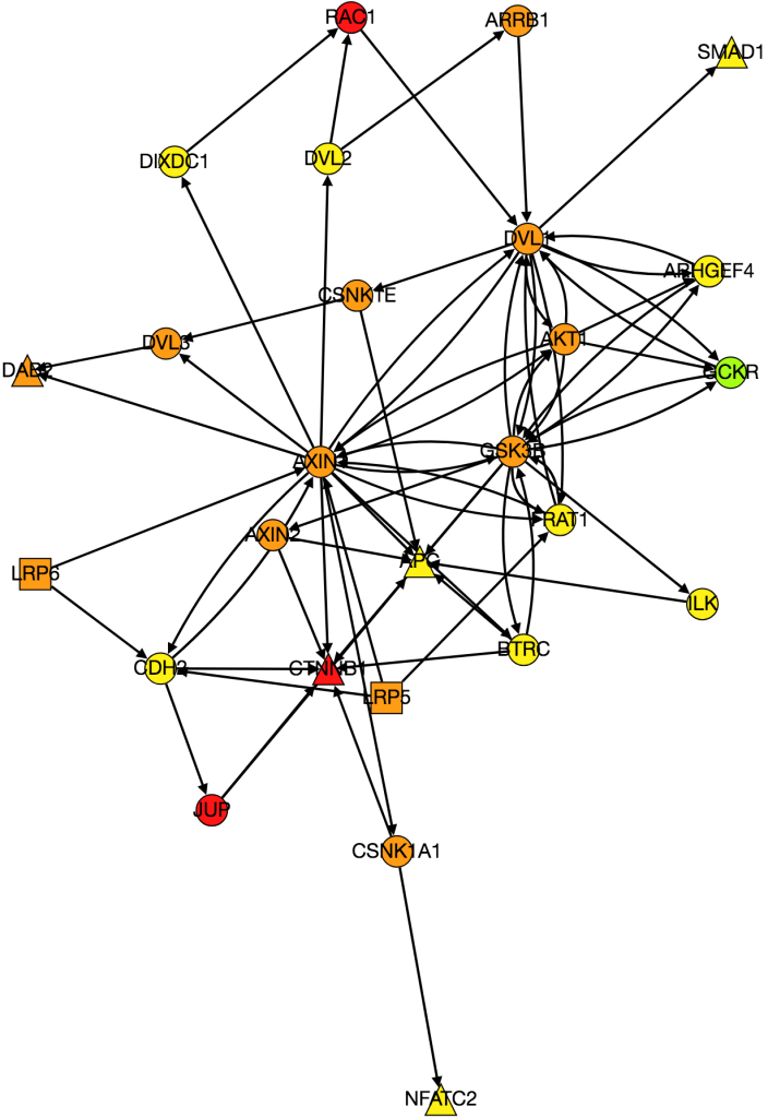
I also worked on integrating gene expression data from Xena into our graph of the Wnt pathway.
Wnt Pathway from PathLinker with Gene Expression Data. Red = high, orange = medium-high, yellow= medium, green = low, blue(not shown) = very low, white(not shown) = no expression. Triangles are transcription factors, squares are receptors, circles are intermediate proteins.
Kathy figured out what was wrong with PathLinker the first time we ran it and re-ran it. I am working on turning it into a graph, but the input data is very different because it’s coming from a different version of NetPath so I need to change the program to be able to process the new data.
I also noticed while I was processing the expression data from Xena that there was a large amount of variability in gene expression between patients. I’m currently working on several things. Instead of just averaging gene expression for genes I’m comparing gene expression patient-by-patient so I’m comparing a tumor sample to a normal tissue sample for every patient. I also want to come up with a way to visualize the variance of expression among patients, because the more variance there is the less significant differences in expression between cancerous and normal tissue are. Anna suggested I do this by making the borders on nodes with high variance thicker. I am also going back and checking my math on gene expression to make sure that it is actually statistically significant and is conducted in a way that is similar to how other researchers have done similar research in the past.
The achievements from last week as well as the goals were laid out in this progress report. Accordingly, I spent the majority of this week working on an implementation of the Bayesian Weighting Scheme I discussed last week. This involved carefully fleshing out all the minutiae of the relevant paper (which I laid out and explained in this document from last week). I then applied the code onto a small toy-network that I made myself and then hand-calculated a few edges to verify my implementation.
Toy Network from Bayesian Weighting Scheme Implementation
I am currently working to implement the weighting scheme onto the HIPPIE Interactome. Thus far this has meant simply writing code to read the relevant text files and format the data efficiently in a way that meshes well with code I wrote for the toy example. Eventually, I will compare the scores of edges from this weighting scheme to the ones on the actual HIPPIE Interactome and further analysis on the differences between the two weighting schemes will probably be among the next steps. Besides implementing the Bayesian Weighting Scheme I have also been working to understand the underlying statistics behind the methods used to weight the HIPPIE Interactome. I will try to have a document that explains the mathematics for this in similar fashion to the one for the Bayesian Weighting Scheme.