
This week I have continued trying to visualize and integrate gene expression data from GDC TCGA onto nodes in Graphspace. This is the graph I have so far:
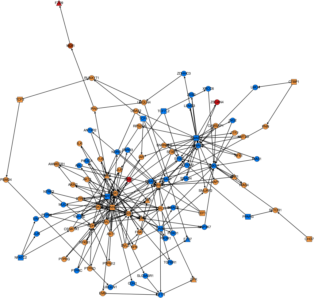
The color of the nodes on the graph represent the mean foldchange of the gene. The foldchange is the ratio of gene expression of a cancerous tissue sample to a normal tissue sample from the same patient. There were 41 patients with colon adenocarcinoma who had gene expression data from both a tumor and a normal sample. The foldchange for each of these 41 patients was averaged to find the mean foldchange of each gene. Light blue indicates that the gene is slightly underexpressed in cancerous samples (less than 1 standard deviation), dark blue(not shown) indicates that the gene is underexpressed by 2 standard deviations, purple (not shown) indicates that the gene is underexpressed by greater than 2 standard deviations. Orange indicates that the gene is slightly overexpressed (within one standard deviation), dark orange indicates that the gene is overexpressed by 2 standard deviations, and red indicates that the gene is overexpressed by greater than 2 standard deviations.
One problem that came up was that some genes have a lot more variance in patient data than others. (Data on variance is available by clicking on the nodes in Graphspace). Additionally, patients that no gene expression or close to no gene expression in their normal samples had extremely high foldchanges that threw off the mean. It’s tempting to just throw away those samples as outliers, however several samples had multiple “outliers”. As an example I’ve included three sets of line graphs I made that show the gene expression data and foldchange of each patient for three different genes:
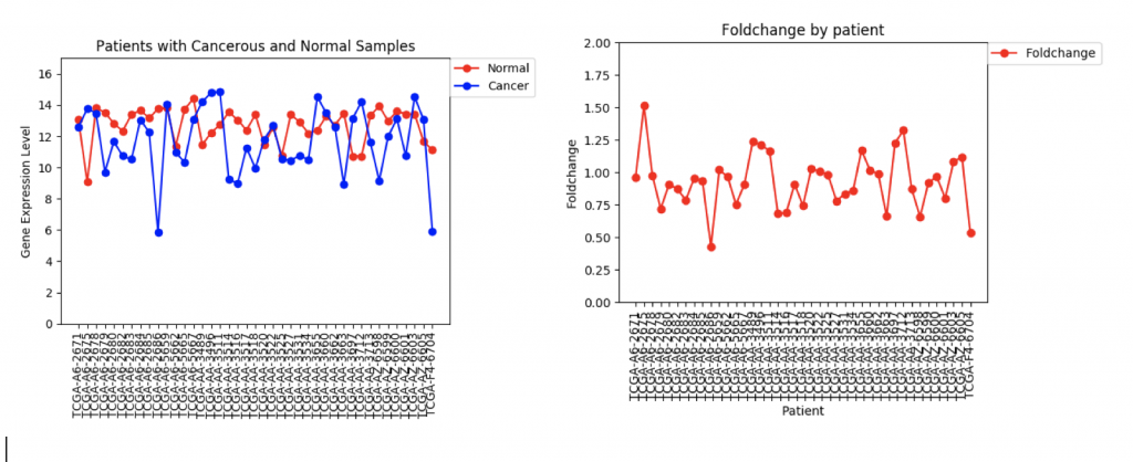
In the first example, CFTR, one can see that cancerous samples tend to have lower gene regulation than healthy samples and most of the fold change values hover around 1.0, meaning that the change is fairly low.
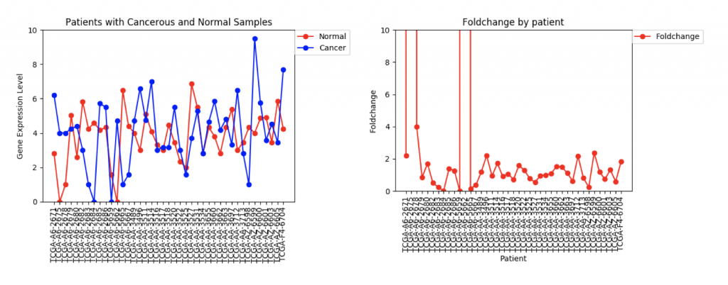
The second example, FZD9, is slightly different. The FZD9 expression data is much less uniform. In some patients, FZD9 is largely overregulated in cancerous samples. In other, it’s largely under regulated. The foldchange data shows foldchanges that range from zero to extremely high values (greater than 30,0000). This occurs because those patients had normal sample values of 0.0. In this case, it looks like dismissing the two extremely high foldchanges as outliers would yield a more realistic data set.
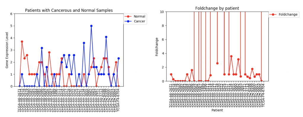
However, in ZSCAN4, there are many patients with extremely high or low foldchanges. Instead of ignoring these patients, I think I need to find a way to normalize the data so that a few large foldchanges don’t completely throw off the data.
The next step in this project is to work with Usman and Kathy to integrate the gene expression data onto the edge weights so that PathLinker can calculate the most disregulated protein pathways. To begin this process, I’ve written a program that produces a text file that contains for each gene the ID, common name, mean foldchange, standard deviation, and either a +1, 0, or -1, which represents whether it’s under-regulated, unchanged, or over-regulated in cancerous samples. Right now the +1, 0, and -1 are really just placeholder values. I need to meet with Ibrahim and Anna to discuss how to better weight the nodes.