Graphery

Hi, I am Larry Zeng, a rising sophomore in Math-CS. I’ve been working with Anna on a website called Graphery. It provides interactive graph algorithm tutorials. A beta version is up and running. It’s hosted on https://graphery.reedcompbio.org. The software is open-sourced and can be found here. This project is also presented as a poster at ACM-BCB.

In this post, I will try my best to describe what this website is about, and what I did.

Graphery: an interactive graph algorithm website. Tutorial

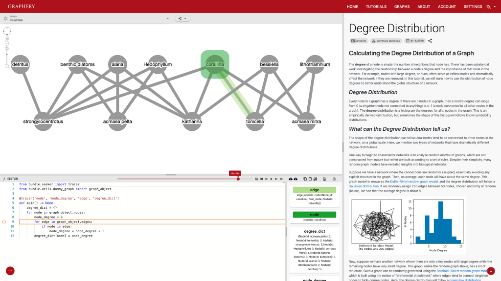
This page should demonstrate the basic structure of a tutorial. It has three sections: a graph section, a code section, and a text content section. The graph section displays actual biological graphs that can be used in the algorithm described in the tutorial. The code section can not only display code but also walk through the code step by step and watch the variables so that changes can be visualized. The orange box and an arrow right next to it is the indicator showing which line is been “executed”. More on that later. On the right part of the editor section is a watched variable list, which shows what value each variable is referencing. If one variable is referencing a graph object, that is, a node or an edge, the object will be highlighted on the graph correspondingly. The text content is the text description of the algorithm.

To provide a pure experience for those who want to practice or who’s interested in and graph and want to see different algorithms applied to it, we also provide a playground. It’s very similar to a tutorial page except there is no text section.

Graphery: an interactive graph algorithm website. Playground

The users of this website should be biologists who are new to computing. We designed this website for them and there are two highlights, real biological graphs, and interaction. They should help the audiences in a unique way than traditional algorithm tutorials.

I can’t talk much about the first point since I am not a biology major. But I can say real biological graphs should bring down the anxiety and unfamiliarity.

As for interaction, which I spent a relatively large amount of time thinking about, it’s not about dragging components of a graph or the ability to zoom in or out. It includes proper input interfaces and feedback.

The current input interface is provided by this control strip.

Graphery: an interactive graph algorithm website. Control Strip

Users can either click on the button or use the slider to pinpoint the exact position they want. This e-book like control system should be clear and easy to get started. However, it also has some drawbacks. Extensibility is one of them. Adding more buttons to this strip would increase the complexity and on a slightly small-screen device, those buttons are too compact to use.

Feedback is also important and most feedbacks are provided by the control strip. We are glad that we found a way to tie code execution and the graph together. On the surface, it works really well and provides enough information about the algorithm. However, some details are not nailed yet. For example, in the picture posted above, you can see (hardly) the number of total steps needed to finish a simple degree counting algorithm on the slider right above the code editor is 500-ish. Who would click 500 times? The visualization is not perfect either. In the variable list, for example, the content of the variables is just laid out in plain text, which is hard to read and may increase the anxiety. There is a long way to go and I hope you can see a better version.

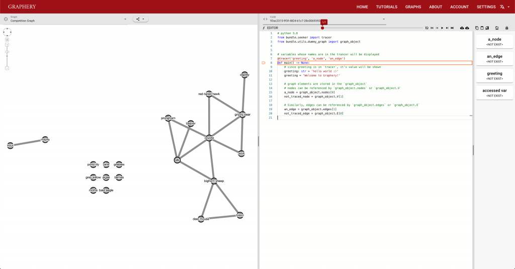
More feedbacks are created by customizing code and run it. This is where things get a little weird since the audience of this website should be beginners who, if I picture them right, just know what if statements and how to write loops, and this functionality is not really tailored to their learning experience since to reach the system’s full potential, one should know what’s decorators and read the documentation of the system or even the source code. However, I think it’s part of the key experience of this kind of unique tutorials. Being able to visualize the result is usually not provided by traditional tutorials. I hope things will get more clear when we have real-world users.

It will be quite interesting to see how this system will work with users and how to improve this system to provide a better experience.

The last part of this post is just some notes on what I did. Overall, the codebase should be improved to make future maintenance easier. If you find anything in the code, please let me know, file an issue or send a PR. I really appreciate your help.

I used Vue.JS and Quasar as the frontend framework. Assisted with Cytoscape.JS, I was able to build the graph display section. The good thing is the frontend looks good and the UI is complete. However, the final result is not as expected. I am looking forward to rewriting a better version in the next few months after the new version of the framework comes out.

The backend system is powered by Django and it’s running GraphQL API. I also modified the PySnooper so that I can inspect Python code. I promised to talk about the “virtual execution” and here are some details. Python allows users to provide a function to sys.settrace so that, when Python has executed a line, it dumps the stackframe of the line and an event about what the line is doing to the function. (See docs for more details). The function I provide looks at the stackframe, evaluates the value of each watched variables, and look at a list of values of the variables from the frame, record the changes, and finally update the variable list.

Thank you Anna for providing such an opportunity. And big thanks for all the contributors, directly and indirectly, making the project happen.

Cloud Computing Platforms Benchmarking

Hi everyone! My name is Jiarong Li and I’m a senior majoring in math and computer science at Reed. During this summer, in order to offer reference information for computational researchers to choose a suitable cloud computing platform, I worked with Anna and Trina to compare mainly four cloud computing platforms: Google Cloud, Amazon Web Service (AWS), Extreme Science and Engineering Discovery Environment (XSEDE), and the Institute for Bioinformatics and Evolutionary Studies from UIdaho (iBEST CRC).

By running three cloud computing projects related to different fields, I analyzed the real application of these platforms in terms of the execution time, computing capacity, storage, customizability, compatibility, and convenience. I designed a scoring rubric and tabulated and summarized the testing results with various plots.

Projects and Testing Results

1. Computational Biology: Augmenting signaling pathway reconstructions (PRAUG) [1]

By running PRAUG to reconstruct signaling pathways and recoding the runtime, I focused on testing the computing ability of the same type of virtual machines from different platforms.

Testing Result

The trend shown in the graph above tells us that virtual machines with more vCPUs take less execution time. Since PRAUG code was originally set to run on a 4-core machine, without setting up multithread, the trend of the decreasing execution time cannot be seen when the number of vCPUs getting above 6.

In the graphs above, I mainly compared the performance of virtual machines from Google Cloud and AWS since they have comparable customizability. With the same settings of virtual machines, we can see that AWS outperforms Google Cloud.

XSEDE and iBEST have less customizability and option of virtual machines. I chose several log-in nodes to run the program and their testing results are:
14 CPUs & 128 GB: 13m33.907s (XSEDE)
16 CPUs & 3 TB: 23m5.172s (XSEDE)
40 CPUs & 192 GB: 31m28.872s (iBEST)

2. Large Image Files Subsampling and Transferring: Tabular data files for 3D still images

By running multithreaded R code to randomly generate a specified number of 3D image subsamples with a certain number of pixels, this project mainly focuses on testing virtual machines with multiple vCPUs as well as the capability and convenience of data transferring and storing of different platforms.

Testing Result

The graph above shows the difference of execution time when we input the same variables and run the single-threaded code and multi-threaded code respectively on a virtual machine with 8 cores and 64GB memory.

In this project, by running multithreaded code, we can clearly see the influence of the number of vCPUs to the execution time.

When I set the number of subsamples to 20 and pixels/sample to 100, the runtime of this R code on VMs from Google Cloud and AWS are shown above. Still, AWS outperforms Google Cloud in some extent. Moreover, I tested more resources provided by XSEDE and iBEST in this project and Jetstream from XSEDE has really good performance.

In addition to multithreaded computing, I also compared the storage and data transferring of these four platforms. I personally like the s3 bucket from AWS the best since it is very convenient to access the files stored in s3 through other platforms and the security settings of private files have great customizability. Data transferring can be easily achieved by Globus among these four platforms and other applications.

3. Machine Learning: Running a machine learning experiment in a specific Docker Image

This project mainly focuses on testing GPU virtual machines and their compatibility with other applications. 

Testing Result

The graph above shows the comparison of runtime when training the ML model on VMs with NVIDIA Tesla T4 GPU. We can see that VMs from AWS run faster than those from Google Cloud.

I also tried to adopt VMs with different types of GPUs and got results shown in the graph above. For more information about NVIDIA Tesla.
I didn’t run this project on GPU nodes from XSEDE or iBEST since I have no permission to set up docker on these VMs. Generally, for all four platforms, users need to request access to GPU VMs and will get either permission or rejection depending on specific situation.

Summary

Based on all the testing results and the user experience I got during this process, I evaluated the four platforms according to the scoring rubric designed at the beginning.

Thanks to Anna, Tobias, Kelly, and Mark for providing cloud computing projects tested in this research.

References

[1] Rubel, Tobias, and Anna Ritz. “Augmenting Signaling Pathway Reconstructions.” BioRxiv. January 01, 2020. Accessed August 29, 2020. https://www.biorxiv.org/content/10.1101/2020.06.16.155853v1.full.

Summer 2020 Research Recap

We have passed the 90th consecutive night of Portland protests for Black Lives Matter. That’s three full months. That’s a whole summer.

There have been over 25,000 COVID-19 cases and 438 deaths in Oregon. The number of infected individuals total the entire population of Forest Grove, Happy Valley, or Wilsonville.

And yet, somehow, the students and staff who did research with me did phenomenally. Let me be clear: our success as a research group was driven by the collective effort of everyone involved.

Continue reading “Summer 2020 Research Recap”

Integrating Cancer Data into Interactomes

Hi all! My name is Aryeh Stahl and I’m a math and computer science dual major at Reed. I’ll be a senior this fall and will be starting my thesis. I had a great time working with Anna this summer!

An interactome is a weighted graph with nodes representing proteins and directed edges representing interactions between these proteins. Anna Ritz et al. (2015) previously developed Pathlinker, an algorithm that finds k-shortest paths from a set of source nodes to a set of target nodes. It aims to “to reconstruct the interactions in a signaling pathway of interest [2].”

In my project, I aimed to integrate cancer data into the previously generated Pathlinker interactome to find significant pathways and/or proteins involved in a given cancer. I obtained driver p-values for most proteins in the interactome. These p-values “indicate [genes’] statistical significance as drivers, according to diverse methods that account for positive selection, functional impact of mutations [and] regional mutation rates [1].”

Once I had mapped these p-values to the corresponding proteins in the Pathlinker interactome, I created new interactomes by diffusing the p-values to outgoing edges and calculating a weighted average with the old edge scores. For example, if a node had p-value of 0.5 and had 5 outgoing edges, the corresponding contribution would be 0.1 for each of the 5 outgoing edges. I then set a parameter, beta, which indicated the weight of the new values and the weight of the old values. If beta = 0, then all of the new edge weight is obtained from the p-value, while beta = 1 will give the original interactome. The following GIF shows the distribution of edge weights as beta changes (beta is 0 when most of the scores are close to 0, while beta is 1 when it is very discrete).


The input to Pathlinker is an interactome, as well as two sets of nodes: targets and sources. The output is a list of proteins and interactions, ranked “by their first occurrence in the k shortest paths from any [source] to any [target] [2].” So, I can run Pathlinker on my new interactomes and get as output a list of significant edges. Ideally, these edges would be significant in the pathway in question (such as the WNT signaling pathway), and for the cancer. Thus, we could identify potential interactions that could be disrupted and contribute to the cancer.

My next issue was to determine if my output was actually significant. I tried to do this by fabricating some data and seeing if my method recovered the edges that I expected. I created randomly weighted interactomes and chose a previously known signaling pathway as a subgraph (in this case I used WNT). I shall call this subgraph A. I then chose some scale factor to upweight the edges in that subgraph, e.g. multiplying each edge weight by a factor of 1.5. Next, I chose a random subset of the nodes of subgraph A (of a specified size, say 50% of the nodes) to serve as an intersection with another subgraph, which I shall call subgraph B. B corresponds to nodes with a high p-value in the cancer data. I then added some more nodes that are connected to this intersection and are outside A (Thus making subgraph B have the same number of nodes as subgraph A). I finally gave each of the nodes in subgraph B a high p-value and created a new interactome.

Running Pathlinker on this contrived data with the WNT sources and targets, I would expect a high percentage of the resultant significant edges would be in the intersection between subgraph A and subgraph B. I further would expect to have a larger number of the significant edges in the intersection as I upweight subgraph by a larger factor. This is exactly what I got. The following plot shows the results from several trials of Pathlinker on new interactomes with a various upweight factor, finding the k = 100 shortest paths.


References

[1] Reyna, M.A., Haan, D., Paczkowska, M. et al. Pathway and network analysis of more than 2500
whole cancer genomes. Nat Commun 11, 729 (2020). https://doi.org/10.1038/s41467-020-14367-0


[2] Ritz, A., Poirel, C., Tegge, A. et al. Pathways on demand: automated reconstruction of human
signaling networks. npj Syst Biol Appl 2, 16002 (2016). https://doi.org/10.1038/npjsba.2016.2

Hypergraph Algorithms

Hey everyone! I am Alex Richter. I am a rising junior in math and computer science working with Anna Ritz this summer on hypergraph algorithms. The algorithms that I implemented this summer were from a paper co-authored by Nick Franzese, Anna Ritz, and Adam Groce [1]. The implementation of the algorithms already existed in Python; however, I learned Java and implemented them in Java to be incorporated into a plugin written in Java. 

We are working on incorporating the algorithm into the application Cytoscape via a plugin called ReactomeFIViz. In doing so, we hope that scientists will begin to examine hypergraph topology when checking to see if two molecules are connected within a cell. In viewing a different topology as opposed to simply directed or bipartite graphs, different pathways can be discovered as well as some nodes in a graph topology might be connected within a cell but not in a hypergraph topology. The potential for hypergraph connectivity in better understanding connectivity within a cell is a field that deserves to be further explored. 

The algorithm that I implemented relaxes the definition of B-connectivity and determines if two nodes are connected in a hypergraph topology. Here are some definitions from the paper: 

  • Directed hypergraphs represent reactions with many-to-many relationships, where each hyperedge e = (Te, He) has a set of entities in the tail Te and a set of entities in the head He (here, the tail denotes the hyperedge inputs and the head denotes the hyperedge outputs). [1]
  • B-connectivity: requires all the nodes in the tail of a hyperedge to be visited before it can be traversed. This definition has a natural biological meaning in reaction networks: B-connectivity requires that all reactants of a reaction must be present in order for any product of that reaction is reachable. Unlike the compound graph rules, B-connectivity describes the strictest version of connectivity, and it is the only rule used to traverse hyperedges. [1]
    • Given a directed hypergraph and a source set SV, a node uV is B-connected to S if either (a) uS or (b) there exists a hyperedge e = (Te, He) where uHe and each element in Te is B-connected to S. We use to denote the set of nodes that are B-connected to S in . [1]

To be B-connected implies that in order to traverse a hyperedge all of the nodes in the tail set (input set) must be present. B-connectivity can be a little bit difficult to understand at first glance. It is a harsh restriction on hypergraph connectivity. Two nodes are B-connected if one of two things is true: either both nodes are in the source set so obviously they are B-connected or the node we are seeing if is B-connected is located in the head (output) set of a hyperedge that where each element in the tail (input) set is connected to original node. 

b_visit Algorithm 

The algorithm that I implemented is two parts. The first algorithm is called b_visit and takes in a hypergraph and a set of source nodes, s. The b_visit algorithm will then return three sets: the set of traversed hyperedges from s, the set of B-connected nodes to s, and the set of restricted hyperedges. Restricted hyperedges are edges that can be reached but not traversed because it is missing an input in the tail to make the hyperedge traversable. For example, given a source set of A, B for this hypergraph, the set of restrictive hyperedges would be: 

Tail Set Head Set 
G, DL
D, H M
I, N O
Set of Restrictive Hyperedges

The set of traversable hyperedges would be: 

Tail Set Head Set 
AC
A, BD
BE
BF
E, FI
Set of Traversable Hyperedges

The set of B-Connected nodes to A, B would then be: C, D, E, F, I. 

Image taken from paper [1].

b_relaxation Algorithm 

The b_visit algorithm helps when trying to find out which nodes are B-connected to the source set, or the set of nodes the algorithm is called on. This is helpful to find those immediate nodes; however, since the requirements for B-connectivity are so strict, this does not include all of the nodes that can be reached from the source set in the hypergraph. Through calling b_visit multiple times and replacing the requirements for B-connectivity, more nodes can be viewed as connected in the hypergraph. 

The second algorithm from the paper is called b_relaxation which makes calls to the b_visit algorithm. The input for b_relaxation is once again the hypergraph and a set of source nodes, s, on which the algorithm will be called. Through multiple calls to b_visit, b_relaxation relaxes the strict conditions of B-connectivity. The algorithm runs on the entire hypergraph to determine which hypernodes are B-connected to the source set. The return value of the algorithm is a dictionary of k-distances where the key is the node and the value is the distance. K-distance is easiest understood as the number of times the algorithm was run until it could reach the node in question. So if it was in the source set for instance, the k-distance for the node would be 0. In relaxing the harsh conditions of B-connectivity, the algorithm is essentially traversing restrictive hyperedges to find all of the nodes that are connected in the hypergraph. 

Using the same toy example, at the end of b_relaxation, it would return a dictionary of distances. 

KeyValue
A0 (source set) 
B0 (source set) 
C0
D0
E0
F0
GINFINITY
HINFINITY
I0
JINFINITY
KINFINITY
L1
M1
NINFINITY
O1
P2
Q2
R3
Dictionary of distances for toy hypergraph after running b_relaxation algorithm
Image take from paper [1].

Anna and I are working with our collaborators in incorporating this into ReactomeFIViz before adding it to Cytoscape. The next steps include cleaning up the code, making sure it works properly in the plugin, and considering implementing further hypergraph algorithms. 

References: 

[1] Franzese N, Groce A, Murali TM, Ritz A (2019) Hypergraph-based connectivity measures for signaling pathway topologies. PLOS Computational Biology 15(10): e1007384. https://doi.org/10.1371/journal.pcbi.1007384

Nets Full of Fish Brains

Hey folks, my name is Gabe Preising and I’m a research assistant for Suzy Renn and Anna Ritz. I’ve always been a bit all over the place with my research interests, and because of that I’ve always been drawn to interdisciplinary research (either that or I’m just indecisive). I graduated from Reed this past May with a degree in Biology, my research interests including behavioral neuroscience, computational biology, and bioinformatics.

I spent my time in the Renn lab studying the African cichlid fish Astatotilapia burtoni. These fish are native to Lake Tanganyika, one of the African great lakes on the eastern side of the continent. They engage in complex social dynamics and because of that, people who study A. burtoni have historically studied the males in the context of dominance hierarchies and aggression. However, the Renn lab focuses their research on female behaviors, and in the case of my research, maternal care behavior. A. burtoni mothers engage in mouthbrooding, which is a ~2 week period where a mother will hold her developing offspring in her mouth. During this time, she will churn them around to circulate fresh air while simultaneously protecting them from predators. The really interesting part of this behavior though is that during mouthbrooding, a mother will forgo eating throughout the brooding period. This implies that somehow, a mother is making a trade-off where she puts the energetic needs of her offspring before her own.

Image taken from Suzy’s website

The way signals from the brain can influence behavior and vice versa is fascinating to me, so I decided to do my senior thesis on the neural signals of mouthbrooding. As I was deciding on a project though, I became interested in bioinformatics and computational biology and wanted to tie each of these fields together. In Anna’s computational systems biology class, we learned about protein-protein interaction networks (i.e. interactomes) and how powerful they can be for investigating a variety of biological questions such as predicting disease genes. We also learned about how you could weight interactomes with external data to alter properties of the network (depending on what you’re doing). So in one sentence, my thesis (and current research) is: use a protein-protein interactome to figure out what’s going on in the brains of mouthbrooding fish. 


Since there is currently no interactome for A. burtoni, I made my own from an existing zebrafish interactome. To do this, I took advantage of two publicly available resources: orthologous relationships [1] and a zebrafish interactome [2]. Orthologous genes are related genes in different species that originated from a common ancestor. Using the program OrthoFinder [3], I generated orthologs between zebrafish and A. burtoni. I then created new edges between all of the corresponding orthologs for the pair of nodes in each zebrafish edge. Finally, I weighted the network with gene expression data from the brain such that redder nodes have a higher expression level in brooding fish and bluer nodes have a lower expression level. The following subnetwork focuses on neurotensin, a differentially upregulated gene in brooding fish.

Neurotensin is involved with both feeding and parental care, and seeing it connected to other neuropeptides like prodynorphin (pdyn) tells me that I mapped everything correctly. I’m going to keep refining my network in the coming weeks and try a different method of constructing it but I’m excited to have a usable interactome finally. Future goals include looking into NetworkX algorithms to run to find clusters of differentially expressed genes.

References:
[1] Smedley, D., Haider, S., Ballester, B., Holland, R., London, D., Thorisson, G., & Kasprzyk, A. (2009). BioMart–biological queries made easy. BMC genomics, 10(1), 22.
[2] Ogris, C., Guala, D., Kaduk, M., & Sonnhammer, E. L. (2018). FunCoup 4: new species, data, and visualization. Nucleic acids research, 46(D1), D601-D607.
[3] Emms, D. M., & Kelly, S. (2019). OrthoFinder: phylogenetic orthology inference for comparative genomics. Genome biology, 20(1), 1-14.

Reconstructing Signaling Pathways by DAGs

My name is Jiarong Li, and I’m a rising junior majoring in Math-CS. In this summer, I’m working on a project related to computational biology with Tunc Kose, Ibrahim Youssef, and Anna Ritz. In the study of protein-protein interactions, we take each protein as a node and the interaction between two nodes as an edge. By building a graph of paths starting from receptors and ending at transcriptional factors, we aim to reconstruct better signaling pathways.

The former method we used to build pathways is PathLinker, which uses k-shortest path (KSP) to get k shortest paths from receptors to transcriptional factors in the collection of protein-protein interactome within a cell. This method, however, reuses a lot of edges and nodes in the process of building the graph. Thus, after a certain point, no new information will be added to the result. In order to solve this problem and get a better reconstruction, we adopt directed acyclic graph (DAG) to grow signaling pathways. DAG is a graph without cycles and all nodes in DAG can be topologically sorted. The algorithm starts from a ‘ground-truth’ graph G_0, which is the first path with more than 2 nodes generated from PathLinker, to grow DAG by introducing a new path that minimizes the total weights of all paths in the graph at every iteration. Here is an example about how the algorithm works.

By using the algorithm described above, we get reconstructions of Wnt pathways generated by DAG below. And a graph got from PathLinker for comparison.

LocPL Wnt Reconstruction with Compartments
http://graphspace.org/graphs/26786?user_layout=6719
Wnt Pathway reconstructed with DAGs

As we can see, in the graph generated by DAG, all of the directed edges do not have reverse arrows directions. The triangles are receptors and squares are transcriptional factors. Yellow nodes represent nodes that are in both Wnt pathway and the interactome and blue nodes represent nodes that are only in the interactome.

With these results, we use Precision and Recall to test the performance of DAG. This method shows us the fraction of relevant instances among the retrieved instances and the fraction of relevant instances that have been retrieved over the total amount of relevant instances. Here is graphs of precision and recall for nodes and edges in the reconstruction of RANKL pathway.

We expect curves to approach to the upper right corner with high precision and recall. However, we cannot really show the obvious advantage of DAG through the this method, which means that we need to explore more ways for testing.

For future researching direction, we are looking for better G_0 options other than the result got from PathLinker. Also, for now, we’re trying adopting different algorithms to grow DAG. Instead of minimizing the total weights of paths in the graph, we’ll minimize the total weights of the graph and compare the result got from different algorithms. Moreover, we realize that there’re certain limits of precision and recall, so we’re looking for a more suitable way to test our current results to show the benefits of the DAG.

Sources:

Ritz, Anna, Christopher L. Poirel, Allison N. Tegge, Nicholas Sharp, Kelsey Simmons, Allison Powell, Shiv D. Kale, and Tm Murali. “Pathways on Demand: Automated Reconstruction of Human Signaling Networks.” Npj Systems Biology and Applications2, no. 1 (2016). doi:10.1038/npjsba.2016.2.

Youssef, Ibrahim, Jeffrey Law, and Anna Ritz. “Integrating Protein Localization with Automated Signaling Pathway Reconstruction.” 2019. doi:10.1101/609149.

Retinoic Acid, Development, and Motif Finding


My name is Tayla, and I’m a rising junior Biology major working on a research project co-advised by Anna Ritz and Kara Cerveny this summer. Overall, my project is trying to understand a vitamin A-dependent biological signaling pathway that is part of the process of stem cells differentiating into neurons.

We’re interested in this process because previous studies have shown that vitamin A is essential to proper embryonic eye development because it alters gene expression at the transcription level via specialized receptor proteins. Understanding this developmental process will provide insight into the complex differentiation process and identifying the involved genes in silico may open avenues of inquiry for in vivo studies. We hope to search for the genes that are affected by this pathway through sequence analysis and analyze how those genes might fit into this regulatory network.

But first, some background: the pathway that I’m looking at is the retinoic acid pathway which is especially significant in the retina of developing zebrafish embryos. Retinoic acid is an active metabolite of vitamin A that allows proteins to bind to DNA and alter the transcription of certain genes (Figure 1). These proteins, called retinoic acid receptors, alter in the presence of retinoic acid to bind to very specific DNA sequences called retinoic acid response elements (RAREs).

Figure 1. Heterodimerization occurs upon nuclear retinoic acid receptors (RARs) and retinoid X receptors (RXRs) recognizing a tandemly repeated hexad motif called a retinoic acid response element (RARE) usually upstream of the direct target gene. In the presence of retinoic acid (all trans and 9-cis), the complex becomes active. This complex can either encourage transcription of its target gene by cleaving the co-repressors or inhibit transcription through repressor factor recruitment.

One of my goals for this project is to find zebrafish genes that are responsive to retinoic acid influxes. To do this, I have to scan through parts of the genome and look for a tandem repeat of a six base pair motif. Retinoic acid receptors bind to these RAREs within the sequence upstream of the affected gene. I can build a program that takes these upstream regions of zebrafish genes, finds this repeated motif, and tells me all the genes that were found.

Figure 2. The RARE motif is composed of 6 base pairs of conserved sequence followed by a space of 1-5 base pairs and then a repeat of the same motif. The spacing in between motifs is used to classify it; for example the motif in the figure is a direct repeat spaced 5 base pairs apart and would be called a DR5.

While it sounds pretty simple, there are actually a lot of moving parts. First I have to read in a big file of sequence and identifying information, and preferably do it quickly. Then I have to find a six base pair motif repeated 1-5 base pairs downstream and score it according to what’s allowed by its documented variation (Figure 2). Finally I have to return the gene IDs of genes containing the repeat. All of this is run on 65,171 annotated zebrafish transcripts’ upstream regions.

Luckily, at this point in my project (about 6 weeks in), I’ve written a program that will do this in about half an hour. Now comes the interpretation: finding out where and at what stage the genes I identified with my program are expressed in zebrafish. Hopefully we’ll find some genes that we expect to be regulated by retinoic acid in the final set of candidates to validate our method. The most exciting prospect is perhaps finding novel genes regulated by this pathway, or better yet a confirmation that the genes we’re testing in the lab as direct targets of retinoic acid exhibit the canonical response site.

Sources:

Al Tanoury Z, Piskunov A, Rochette-Egly C. Vitamin A and retinoid signaling: genomic and nongenomic effects. J Lipid Res. 2013;54(7):1761-1775. doi:10.1194/jlr.R030833

Cunningham TJ, Duester G. Mechanisms of retinoic acid signalling and its roles in organ and limb development. Nat Rev Mol Cell Biol. 2015;16(2):110-123. doi:10.1038/nrm3932

Lalevée S, Anno YN, Chatagnon A, et al. Genome-wide in Silico Identification of New Conserved and Functional Retinoic Acid Receptor Response Elements (Direct Repeats Separated by 5 bp). J Biol Chem. 2011;286(38):33322-33334. doi:10.1074/jbc.M111.263681

Predki PF, Zamble D, Sarkar B, Giguère V. Ordered binding of retinoic acid and retinoid-X receptors to asymmetric response elements involves determinants adjacent to the DNA-binding domain. Mol Endocrinol. 1994;8(1):31-39. doi:10.1210/mend.8.1.8152429

Week 7: Node Scoring

I have spent most of this week trying to transform the gene expression data and implement the equations that Ibrahim came up with to incorporate gene expression data onto edge scores.

I have had several major hold-ups to accomplishing this.  The first is pretty simple, I just don’t know how to get the kind of data output I want from the CDF function because the scipy.norm.cdf() function outputs an array and I want a single value for each node.

The biggest issue is that the TCGA data on gene expression and PathLinker use different gene nomenclature systems. The TCGA relies on Ensembl IDs whereas PathLinker relies on UniProt IDs. Originally I tried to convert all the Ensembl IDs to common names to UniProt IDs because I have a file that contains UniProt IDs and common names, and another file that contains Ensembl IDs and common names. However, this didn’t work because a single gene may have multiple common names and may refer to multiple UniProt IDs (for example there are about 20 UniProt IDs that correspond to the HLA-A gene).

Therefore, to avoid the loss of data due to various common names, I tried to make a dictionary of Ensembl IDs directly to UniProt IDs. I was able to obtain a file that contained both UniProt and Ensembl IDs from the HUGO Gene Nomenclature Committee website. However, converting between Ensemble and UniProt came with its own problems. First of all, there are many genes that either only have UniProt IDs or only have Ensembl IDs. 997 genes in the interactome were unable to be converted from one to the other because of this reason. In addition, many of the Ensembl IDs in the TCGA file (over 16,000) don’t line up with any of the Ensembl IDs in the dictionary I constructed.  I think this might be because the Ensembl IDs in the TCGA file include version numbers at the end of each ID. The version number is the decimal point at the end of the ID name. For example for the gene, “ENSG00000242268.2”, the “.2” means that this is the 2nd version of that gene. I think one way to fix this problem might be to just take all the version numbers out of the gene name when constructing the dictionary from the TCGA file. However, I can’t figure out how to do this without making the code super slow. If every version number were a single decimal place (ie: .1, .2, .3 … etc), I would just cut off the last two digits of each name which wouldn’t be that slow. However different IDs have different number of decimal places. For example, if I cut off the last two digits of “ENSG00000167578.15” I would still be left with the decimal point. Therefore the only way I can currently think of to get rid of the decimal and everything following it is to use a for-loop that goes through every character in the name and if the character is a decimal point to cut the string there. However, if the program has to go through every letter in every gene name, it’s going to be extremely slow. Maybe something I could do is pre-process the data to create a text file that contains gene IDs without the decimal places so it only has to do it one time and won’t slow the whole code down, but I feel like there has to be a faster way to do it within the program.

Week 4: Parsing Files

This week, I discovered how to download files from the TCGA database, and explored their structure.

So this week, I downloaded 512 files relating to colorectal cancer (COAD in the TCGA database.) These were compressed into a Tar file, which opened into a directory tree that looked like this:


Each tiny blue dot is a folder, and inside each folder is one gzipped file (compressed). And each one of these files is a sample from a patient with gene, and its expression (from either a tumor sample or a healthy one.)

So my main issue has been to try and parse these files into a data matrix, ideally with sample-ids on the top and gene expression on the sides. So far, I’ve been able to compress these files into patient and samples relating to them because ideally, we want to look at gene expression in a healthy and tumor sample from the same patient. However, I haven’t been able to write the sample-ids with gene expression data into a file because of multiple bugs and errors. My goal for next week is to get these errors fixed.