Ecology Modeling: Thermal Variation and Phytoplankton Fitness

My name is Amy Rose, and I’m a post-bac in Anna’s lab this summer. I graduated last month with an Alt. Biology degree with an emphasis in Computer Science. Taking Anna’s classes in my first two years at Reed was the start of my interest in computational bio. I spent my junior year studying computer science at The University of Sussex, and after this summer I will be starting as a software engineer at Puppet here in Portland.

When it came time to find a thesis project, I thought it would be interesting to explore an area of biology that I hadn’t had time to study while at Reed. I was coadvised by Anna and Sam Fey, who is an ecologist. Sam’s research on thermal variation led me to my project, which focused on modeling the effect of thermal variation on freshwater phytoplankton using real world data.

Phytoplankton are ectothermic, which means that they are not able to regulate their own body temperature. Additionally, due to their small size it is difficult to empirically measure the variance in their body temperature due to movement through thermally variable environments. My thesis began to resolve the impact on movement on body temperature and fitness. In this context, fitness represents the overall change in population size of phytoplankton based on temperature-dependent birth and mortality rates.

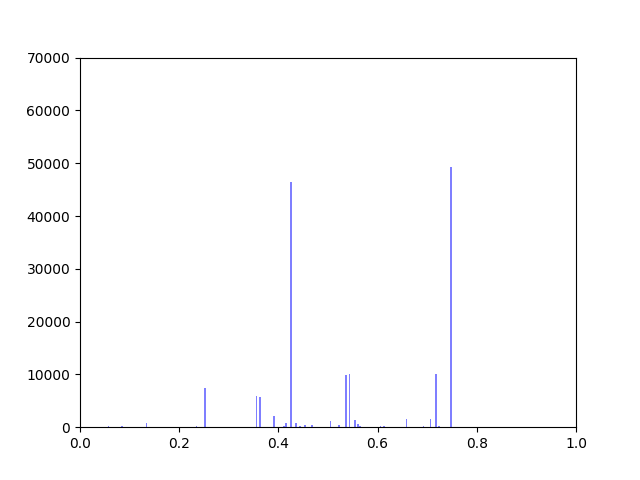
Temperature data was collected from Sparkling Lake in Vilas County, Wisconsin at intervals from .5 to 3m throughout the lake with a frequency as high as every minute over a period of 26 years. We interpolated the collected data to fill in estimated temperatures over depths which were not collected, as seen in the figure below.

Interpolation of data across space. Data was collected at discrete intervals, but linearly interpolated to fill in gaps.
Sparkling Lake temperature data from the 1989 season before and after interpolation. The left figure shows the recorded temperatures collected at each measured depth. The right figure was made through interpolating the temperature at each 0.01 meters given the actual data.

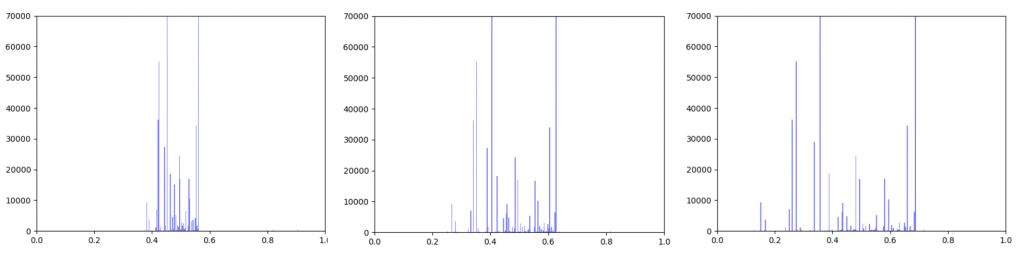
We created five algorithms representing different theoretical patterns of phytoplankton movement throughout the water column, which we plotted against the data. This gave us a framework to understand the limits of what body temperatures phytoplankton may be experiencing. The second stage of the project was to plot these simulated body temperatures against a function representing phytoplankton fitness.

This summer, we hope to extend my thesis research over space and time. For my thesis, we focused on a single season, but we’re currently looking at extending the movement algorithms over all 26 years of data. We’re also interested in exploring more datasets sourced from lakes in different geographical locations. Additionally, we’re analyzing the effects of changes to the fitness function.

Summer Research 2019 – here we go!

Reed has finished for the year, but that doesn’t mean that students are done. Last week kicked off a slew of undergraduate researchers doing all kinds of research. In no particular order, here’s a taste of what people will be working on in the compbio lab. Stay tuned for occaisonal group updates.

Math-CS major Jiarong (Lee) Li ’21 and biology major Tunc Kose ’22 are going to develop algorithms to analyze a cell’s response to external signals (called signaling pathways). They will be working to extend ideas based on the original PathLinker paper and Ibrahim Youssef’s Localized-PathLinker paper.

Recent graduate Amy Rose Lazarte ’19 (alt. bio major with a CS emphasis) will continue to develop a resource and modeling framework for understanding the effect of thermal variation on freshwater phytoplankton. Co-advised by ecologist Sam Fey, she has developed a computational pipeline to analyze longitudinal lake temperature data using simulations of phytoplankton swimming strategies.

Biology major Tayla Isensee ’20 is working on identifying targets of retinoic acid signaling in zebrafish eye development. She has a hand in the wetlab work with developmental biologist Kara Cerveny, and she will be building a zebrafish protein-protein interaction network to find potential regulators to test. First, though, she’s going to hunt for retinoic acid response elements (RAREs) in the zebrafish genome to identify direct targets of retinoic acid.

Another recent graduate, neuroscience major Alex King ’19, will be wrapping up his thesis work to build a network that integrates gene, transcript, and protein relationships in order to identify dysregulated pathways in polygenic diseases based on genome-wide association study (GWAS) data.

Biology major Karl Young ’20 will be reading up on computational modeling in neuroscience, and figuring out the intersection of my world (algorithms for biological networks) and neurobiologist Erik Zornik’s world (neural circuits and how they affect behavior).

Last but not least, CS graduate Ananthan Nambiar ’19 will be getting his thesis ready to present as a poster at ISMB/ECCB in Basel later this summer. He modeled proteins as language with the help of his main advisor, natural language processing (NLP) expert Mark Hopkins in CS.

Week 10: Fixing Up Nodescoring

Anna and Ibrahim came up with two new ways to weight the nodes, both of which have produced a far greater range of nodeweights than the original nodescoring.py program did. The histograms for the new node weights are as below:

Convolution weighted nodes

Empirical weighted nodes

Beyond that, I have spent most of this week making small tweaks to nodescoring.py so that it runs more smoothly.

Week 9: Fixing Nodescoring.py

In my last blog post, I talked about how I was concerned about how small the range of normalized node scores is. This week I’ve been trying to figure out why that is. To do this I’ve been making histograms of each step of the process from foldchange to Xv to Cv. This is an example of that process for one gene:

Distribution of foldchanges across patient samples for a single gene.

Distribution of Xvs across patient samples for a single gene

The Cv of the gene above was 0.5000000003. Unfortunately, it looks like a lot of genes even with fairly different fold change and Xv distributions end up with very similar Cvs.

Ibrahim realized that this is occurring because there is an error in the equations we were using so we will have to rethink the way we normalize the data.

Week 9: Cell tracking

So now we are in the experimental validation phase. This week, we ran a trial run of the cell tracking software, using newly cultured cells from a drosophila melanogaster, or fruit fly, line. These lines are suitable for validating that the genes are involved in cell motility due to the high degree of conservation between humans and fruit flies in basic cellular mechanisms.

Week 7: Matrix Files

This week, I’ve been creating a tabular file with all TCGA-COAD samples at the top of the file as column names, with genes at the sides. I should have a 512 x 60484 matrix file when done. However, with Sol’s help I realized that the file I initially output was actually 512 samples at the top, with only 443 columns after, but still with 60484 lines to the file.

Therefore, I think there’s something wrong in how I’m categorizing/organizing the samples.

Week 8: Putting Everything Together

This week Kathy, Usman and I  met to discuss how we would combine the projects we’ve been working on into a cohesive pathway and how we would analyze the output of CancerLinker as compared to PathLinker.

I have been working on ways to visualize the data. One thing I wanted to look at was how incorporating gene expression data would change the overall distribution of edge weights in the interactome.

The original interactome has a reasonable distribution with two values that seem to appear frequently around 0.4 and 0.8.

Original Interactome

Gene expression data was incorporated into the original interactome with a beta value. The beta value determines the weight of the original edge weight when including the gene expression data. So the higher the beta score, the lower the importance of the gene expression data. I made three histograms one for a beta=0.25, one for beta = 0.5 (equal contribution between original edge weight and gene expression data) and one for 0.75

Distribution of edge weights with gene expression incorporated.
Left B=0.25, Middle B=0.5, Right B=0.75

As can be seen in the histograms above, when gene expression data is weighted more heavily, edges weights are more closely clustered. To investigate why this occurred I made two additional histograms: one of the gene expression data before it was transformed and one of the gene expression data after it was transformed.

Left: Gene expression data before transformation
Right: Gene expression data after being transformed

After the gene expression data is transformed, there is extremely little variation. Additionally all the gene expression data is greater than or equal to 0.5 which should be the median. This would explain why weighting the gene expression data more heavily causes more closely-clustered edge weights.  I’m not sure how to fix this. It seems like an error, but I’ve been over the code multiple times and the math seems right to me. So my next step is to figure out what’s going on there.

In the meantime I took the output from the pipeline that Kathy put together and put graphs for the top 1000 Wnt paths with β=0.25, 0.5 and 0.75 up on GraphSpace. If I figure out what’s wrong with the function that transforms the edgeweights, I will run it again and re-upload the updated graphs.


Summer Week 8: Positive and Negative Sets

I was curious about what our AUC would look like if instead of comparing hidden positives to unlabeled, we compared hidden positives to hidden negatives, wondering if that would get us a more valid representation of the network’s ability to predict genes associated with schizophrenia. What if the unlabeled genes ranked above the hidden positives were simply actual centers of genetic perturbations in schizophrenia?

Oddly enough, the scores actually decreased from 0.65-0.70 to 0.60-0.65. I found that the AUCs for comparing hidden negatives to unlabeled nodes hovered around 0.53, meaning that the hidden negatives were ranked mostly in the top half of the list.

This somewhat makes sense though. The basis for the negative set is that they are genes in non-neurological diseases, but that doesn’t necessarily exclude them from being included in a more subtle, polygenic disorder that’s dependent on additive effects of hundreds of genetic perturbations. It also makes sense that genes involved in other diseases might have a slightly higher probability of being associated with some other disease.

I decided to make a new negative set. I started by gathering every single node in the 0.150 network. There is a resource called SZGR 2.0 (https://bioinfo.uth.edu/SZGR/) that collects all sorts of evidence for genes being associated with schizophrenia. Using this list, I excluded any gene that had any evidence for being associated with schizophrenia. I then took differential gene expression data from autism spectrum disorder, bipolar disorder, and major depressive disorder as well as schizophrenia (http://science.sciencemag.org/content/359/6376/693). If a gene was not differentially expressed in any of these diseases (FDR>0.5 for schizophrenia, FDR>0.2 for others) and was in the other list, I added that gene to my list of negatives, which was 1561 genes long. I found that this list, when hidden negatives were compared to unlabeled genes, had an AUC of about 0.44, which means that our negatives are finally oriented around schizophrenia rather than non-neurological diseases. I also found that the AUC for hidden positives vs hidden negatives spiked up to 0.75, meaning that our program is legitimately good at predicting genes associated with schizophrenia.

I found no significant performance differences from factoring in evidence levels.

Pathlinker Interactome Weighting

This week I began to write code to weight the Pathlinker Interactome using the Bayesian Weighting Scheme. This will be useful to compare the HIPPIE and the Pathlinker Interactome but it also serves as a check to confirm whether the code accurately weights the interactomes. The Pathlinker Interactome was initially weighted using the same scheme and so the weights generated should match the pre-existing weights of the interactome. Next steps will involve comparing the two interactomes.

I spent some time writing code that allows conversion of a list of Uniprot IDs to the common name of the genes. This code will probably prove useful at some later point. I extended this to convert from Ensemble IDS to Uniprot IDs as well. However, the Ensemble and Uniprot databases do not entirely overlap and so there are some Ensemble IDs with no corresponding Uniprot IDs. I currently have no ideas about how to solve this problem but it does not appear to be one that needs to be urgently solved.